5 Reasons we are switching from Photoshop to Sketch
The TWK design team have used Photoshop for all of our web design needs since the business began back in 2005. Only recently has a serious contender to its crown emerged – Sketch. The app made by Bohemian Coding is fast becoming the interface designers’ tool of choice. Here are 5 reasons why our design team have decided to take the plunge…
1. A LIGHTER AND FASTER EXPERIENCE
Photoshop is a Pandora’s Box of tools and functionality. Its vast armoury has long been its strength, being the majority of web designers’ software of choice since the early 90’s. Ironically, this is also a big reason why people are now moving to alternatives such as Sketch. Photoshop was never intended as a web design tool, however it’s flexibility has enabled designers to mould it into a powerful interface design program.
Photoshop’s core strength and the reason it was first created was photo editing. This is what the majority of its functionality is designed for.
There are hundreds of tools and options and this inevitably makes the overall experience cumbersome and slow – it carries a lot of excess! For an interface designer this can become extremely frustrating, as building up heavy layers of images and design assets in a single file can quickly grind to a halt.
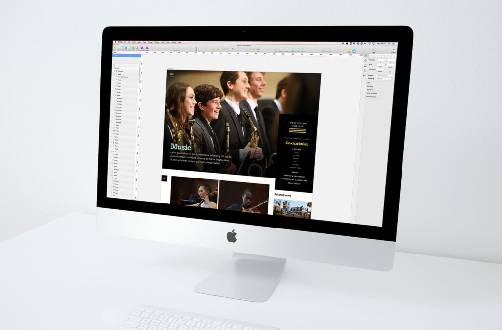
Sketch holds a huge advantage over Photoshop in this department because it was purpose-built for interface design, meaning there is no redundant functionality to slow down your workflow. It is extremely light to run and therefore provides a much quicker experience for the user. It must be said that Photoshop is still a designers go-to tool for photo editing so will always be needed, however Sketch really does win the battle of speed when it comes to website or app design.
Sketch holds a huge advantage over Photoshop because it was purpose-built for interface design.
2. VECTOR PRECISION
A huge part of interface design is the creation of assets. These are the individual design elements that make up a website – such as logos, icons and other graphic elements. No matter what medium you are designing for, best practice has always been to create these assets as vectors using software such as Adobe Illustrator. Photoshop is a pixel-based program and therefore doesn’t allow you to create or edit vectors directly. This has always been a frustrating disconnect in the design process – the constant juggle between two different graphic formats.

Sketch has solved this issue because it is also a vector based program. Raster graphics are used less and less on the web, particularly since the introduction of scalable vector graphics (SVGs). This is the format of choice for today’s interface designer because of their ability to scale without losing quality. Sketch supports importing, live editing and exporting of vector graphics which saves time and makes for a much more seamless design experience.
SKETCH MAKES IT SIMPLE to Export your WEB assets as SVG’s to ensure they scale seamlessly without losing quality.
3. AN INTERFACE DESIGNER’S TOOLKIT
The tools in Sketch are set up perfectly for interface design. Photoshop has become much better in recent years and has done its best to add features to aid web designers, however it just all feels too forced. It is trying to cover too many things which can make it hard to manage. Sketch is designed from the ground up for interface design so its tools have a clear purpose. Symbols are the perfect example. Any assets that need to be repeated throughout a design such as buttons or icons can be created once and dropped in at the touch of a button. This means that if you update the master symbol, all instances get updated through your designs. Easy!
Another great aspect of Sketch is how the units and measurements are directly relevant to those used in CSS.
This is an area that Photoshop falls down in. This allows designers to be confident that their designs will translate accurately when coded by a front-end developer. In Photoshop, attributes such as letter spacing are measured in a different way to CSS, meaning time-consuming conversions need to be done. When combined with the Invision Inspect tool (read on to find out more about this!), it really is much quicker and easier for developers to interpret designs from Sketch than from Photoshop.
Another great aspect of Sketch is how the units and measurEments are directly relevant to thOSE used in CSS.
4. SEAMLESS HANDOVERS
Here at The Web Kitchen we are always looking for ways to sharpen our workflow. A huge part of our overall process is the handover of design files from designer to developer. The front end development of a website is reliant on the developer’s interpretation and understanding of the design they have been given. Up until now, this has involved opening Photoshop files provided by the design team and essentially picking them apart to determine all of the details and assets they need to transform the design into HTML and CSS.
A recent innovation from the team at Invision looks like transforming the handover process.

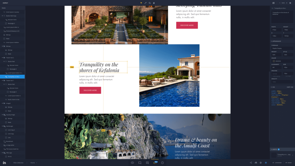
We have long used Invision as a tool to present static design prototypes, both internally and externally to clients. As useful as this is, their new Inspect tool could really be a game changer. We will now be able to sync our live Sketch files directly to Invision, where our developers will be able to inspect every aspect of the design! Margins, sizes, fonts, downloadable assets and lots more. There will no longer be a need for the tedious handover of bulky Photoshop files. Developers won’t even need any design software. They simply log into Invision, and it’s all there waiting for them.
This is clearly a huge improvement to the design workflow and one the whole Web Kitchen team are really excited to start implementing.
sync Your live Sketch files directly to Invision, where developers can inspect every aspect of the design!
5. ENDLESS PLUGINS
A huge benefit of Sketch is that there is already a buzzing community of developers, users and contributors who are driving the app forward. The direct result of this is a significant library of plugins that aim to improve the user experience of the software and add useful bits of functionality and shortcuts that don’t come preinstalled. It’s early days for TWK with Sketch but we are already in love with the Craft plugin which, amongst other things, allows you to quickly duplicate design elements and fill them with realistic dummy content from the web.
As a team we are placing more and more emphasis on the importance of real content from the initial design stage onwards, so we often write content from scratch within our designs. That said, plugins like Craft are still very useful in certain situations, as are the mountains of other plugins that are available.
Browse the plugin library and sharpen your Sketch workflow today!
Overall, after much testing and research, we are confident that Sketch is going to make a big improvement to the day-to-day life of our design team and to the workflow of the TWK team as a whole.


