9 ways to create the best school website (Part 3)
This is the third and final instalment detailing our key tips to build the best school website. Check our blog page for the first two posts.
7. Think mobile!
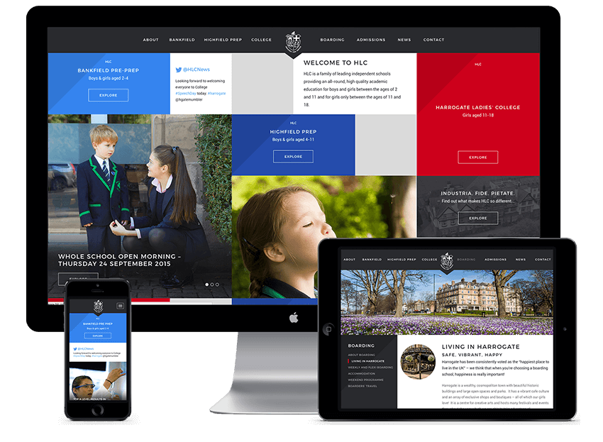
Internet usage from a mobile device is now higher than from any other device in the UK, so ensuring that your website renders well on all mobile devices is a minimum standard these days. Virtually all modern websites are ‘responsive’ to the size of the user’s screen, but we think that school in particular should go further, and consider the difference between mobile users and desktop users. Visitors from a mobile device are likely to be ‘on-the-go’ and therefore are more likely to be interested in ‘current’ content such as fixtures, results, news or contact details than the history curriculum in the sixth form.
That’s not to say that all content shouldn’t be available to a mobile user, but we believe that it’s sensible to show a bespoke design to mobile users that highlights the content those visitors are most likely to be interested in. We have therefore created a mobile web app that looks and behaves like a native mobile app, but is the default site the visitor reaches when they access the site from a mobile device. Just visit the Marlborough College website from a mobile device and you will get the idea.
8. Use video
Video content is playing an increasingly important role in communicating the best of a school and we strongly recommend the use of videos in the site. HTML5 full-screen videos on the homepage can be a great way to give your site wow-factor, an approach we’ve taken with Bilton Grange, Woldingham School and Spratton Hall School.
Short clips can also be a great addition to specific pages in the site, and a 2 minute video showcasing the best of the school is almost expected these days. Too many school videos feature ‘talking Heads’ covering an array of messages leaving the viewer none the wiser to the true character of the school. In a similar way to the website, a video should have a unique concept that reflects the unique character of the school, and should feature no more than 3 messages per video. We work with a fantastic video producer who can work with you to establish what is best for you.
9. Content is key
Ultimately any website requires clear and engaging content to succeed. Fantastic imagery is the minimum requirement for modern websites, so we make sure we audit a schools photography at the start of the project to identify gaps and establish the need to commission a photographer. We are happy to work with any photographer but can recommend some excellent contacts if required.
The style of the writing also needs to be established depending on the character of the school. Sometimes a consistent tone of voice is important, but some schools might find that staff and pupils writing in the first person is a great way to show the personalities within the school.
Finally, it’s important to make the most of any content you may already have, without any duplication of effort. The Sevenoaks School website is based on a magazine style whereby the site is driven by fresh content, and is a great example of using multiple sources of data to ensure that the site is easy-to-manage with content being pulled in from iSAMS for the Calendar, School Sports for the fixtures and results, Flickr for the image galleries, Vimeo for video content, and the only the website itself for News.


