Beyond the boring: The importance of wow factor
There are some people who would argue that a lot of websites look the same. Logo in the top left, menu in the top right. Banner image below that followed by content below..
Now, there are two things you can do. You either try to completely re-invent the wheel, or combine tried and true user experience and design elements with things that make your website design look unique. Below I’ve listed a few things you can do, to break the barrier of boring.
1. Use video
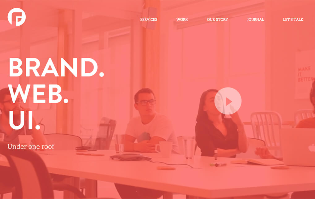
Video is a great way to portray your message to the visitors of your website. A picture may say a thousand words, but a well-directed video says a million. Just think about it: In a video, you can show series of events and processes just the way you want them to. It allows for a more engaging and interactive experience. A moving video always catches the eye of your audience, and with today’s HTML5 technology, it’s a piece of cake to implement as well!
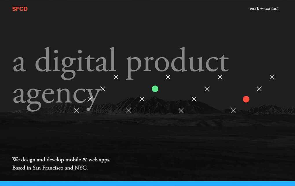
2. Get weird with layout
Shut down your laptop, and stop thinking about breakpoints and grid systems for now. Take a pen and a piece of paper, and just imagine how your website layout could be interesting and usuable. Everything goes as your paper is your canvas, and the only limit is your imagination!
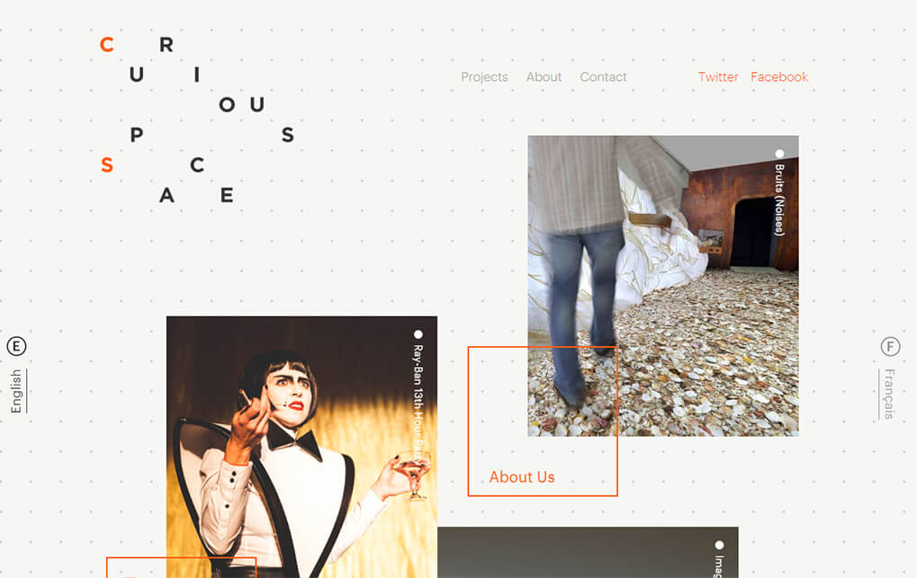
3. Play with shapes
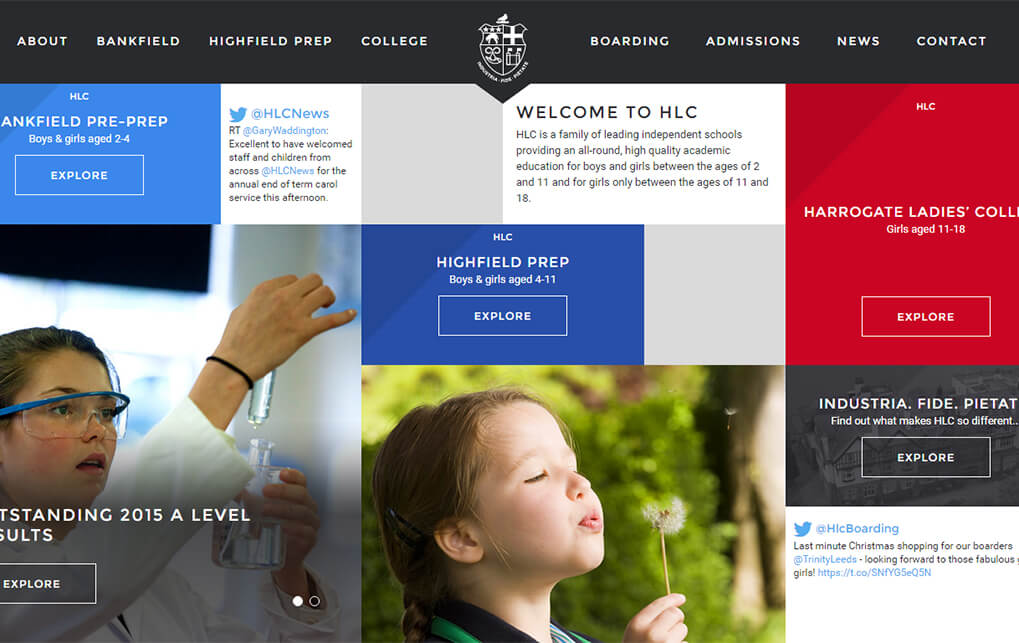
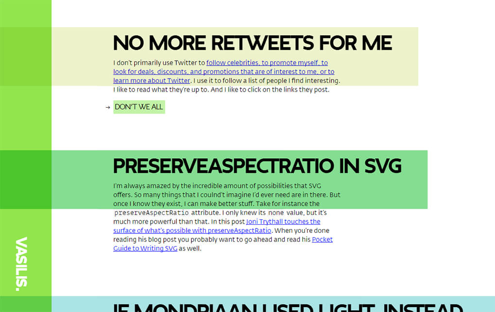
Not everything has to be a rectangle! There are so many shapes out there, why not try to think out of the (square) box and expand your horizon? Hexagons, octagons, you name it!
Making shapes other than squares and rectangles used to be impossible without using images on websites, but with today’s CSS3 magic, it’s all possible.
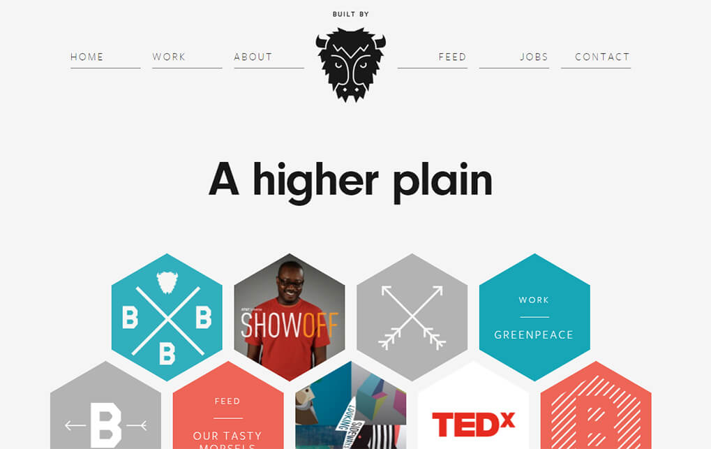
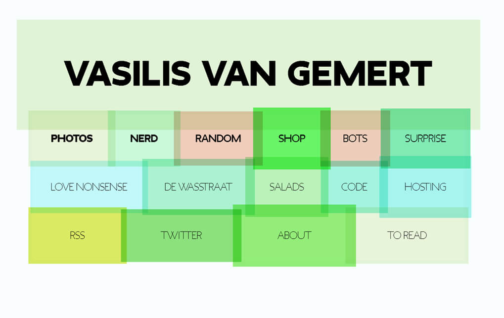
4. Vary layouts
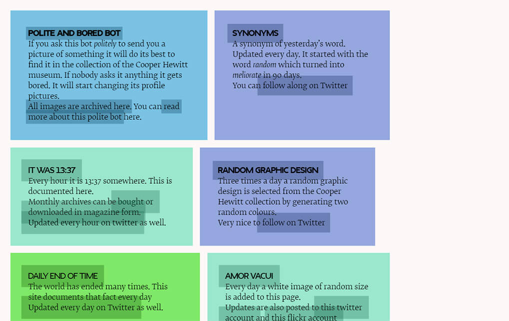
If you’re smart about it, a surprise is hiding right around the corner for your site’s visitors. Switch up the colours, the fonts, and the layout from page to page. Of course it would be smart to keep certain elements in the same place throughout the website to avoid confusion for the visitor, but the way you present your content can be totally unique for every page!
5. Create a unique visual theme for your entire site
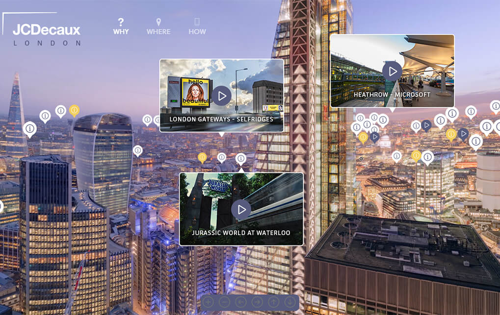
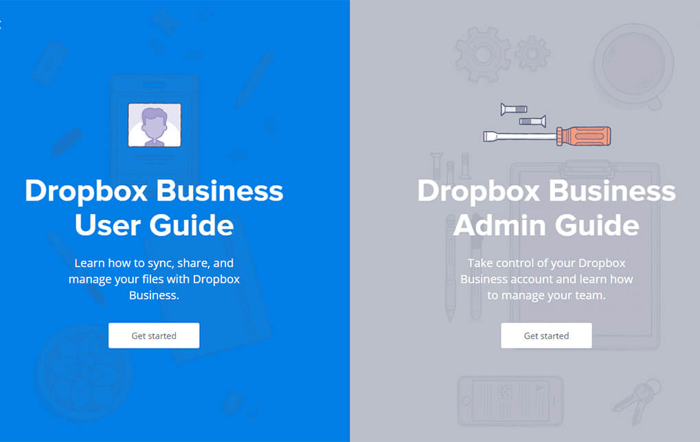
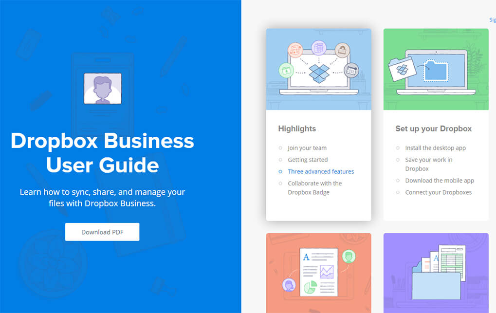
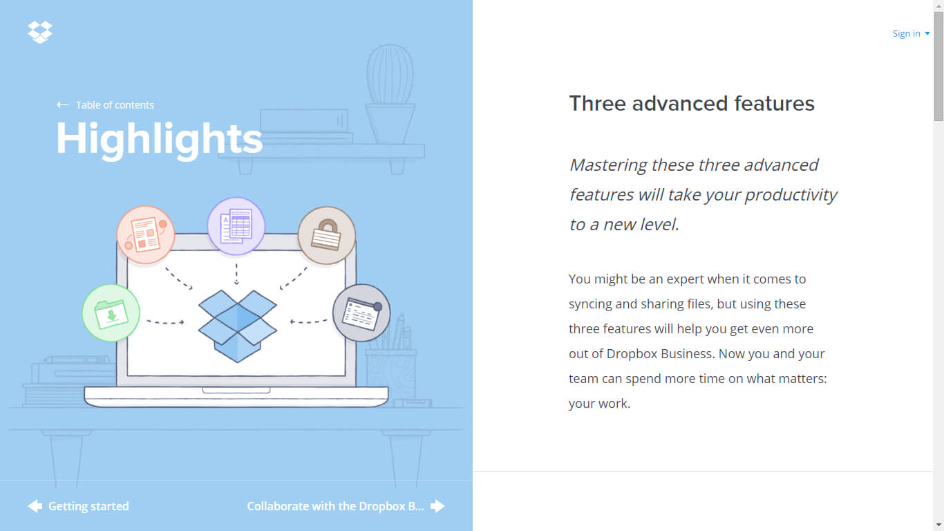
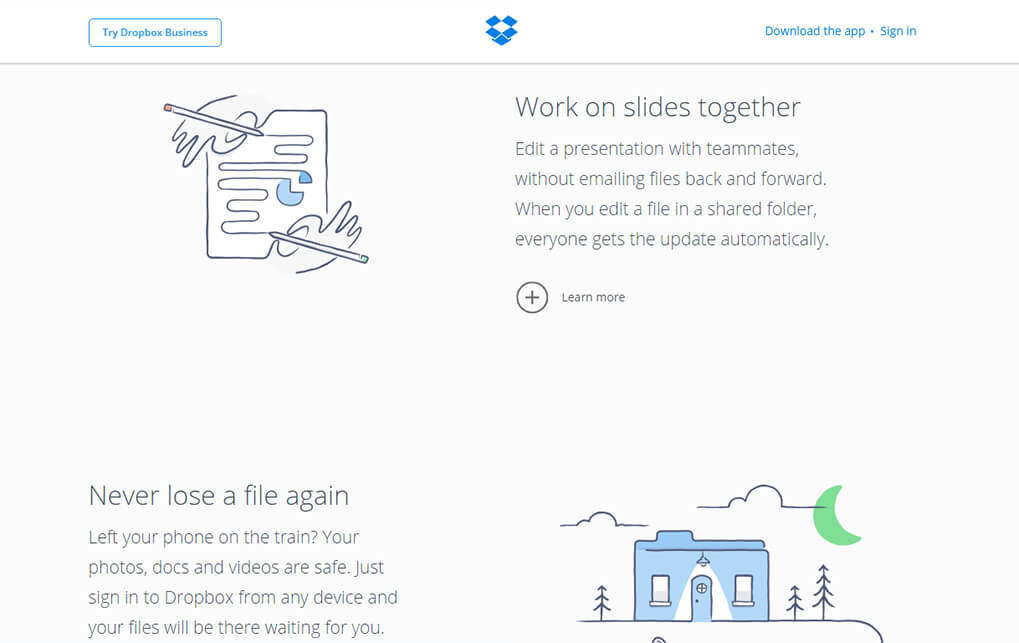
The use of unique colours and visuals can really set your website apart. Especially if you use photography, video or animations that were specifically made for your website! A good example of creating a unique visual theme is Dropbox. Dropbox uses these illustrations that are friendly yet simple, straight to the point yet playful.
Website designs and the trends that come with them will always change. Though it may not be the wisest thing to completely break the mold, there are certainly ways to make your website stand out, while keeping navigation and user experience fluid and natural. Similarities between sites ae always going to be present, but the brilliant thing about web design is that it is never stagnant!


