The TWK Design Workflow: Part 1 of 2
As most designers will tell you, crafting any website design is often anything but simple. Clients always have goals they would like their website to achieve – a designer’s challenge is how to reach these goals in the clearest and most engaging way. In Part 1 of 2 we provide some insight into the workflow of our design team, from the initial briefing meeting up to formulating an engaging website concept…
THE BRIEFING: WHAT, WHO & WHY?
Briefs can vary hugely from one project to the next. Whether they are long and detailed or short and sweet, it’s always worth having a set of key questions to hand to ensure you come away from a briefing with all the information you need. Of course you need to ask about user groups, client competitors and brand assets, however here are a couple of questions that may not be so obvious that can really aid the design process…
Are the brand guidelines crystal clear?
Brand guidelines can be a double-edged sword for a designer. On the one hand it can be a real treat to be given a fairly loose set of guidelines. It allows you flexibility and space to explore creative possibilities in order to add to or improve on a brand that you did not create. However this does also present a greater opportunity to veer away from the existing brand which could potentially jar with the client’s expectations. On the other hand, a detailed and comprehensive set of guidelines can provide reassurance and security for a designer. This allows you to progress with your designs safe in the knowledge that the style you are using is on brand and has a much lower risk of shocking the client. The downside is that this can often stifle creativity and force your designs down particular avenues you may not want to take. Whichever of these scenarios you face, the key is to take the time to establish a clear understanding of the brand guidelines – enabling you to question the client appropriately and set clear expectations regarding how you intend to interpret their brand.
What is the budget for the project?
It’s vitally important for designers to have a strong understanding of the financial side of a project and of your agency as a whole. The budget for an individual project is important to know so that you are able to make concise, rational decisions about the complexity and functionality of your design. Does the client have the budget for a HTML5 background video? Does the budget allow the time needed for the developers to build the parallax scrolling effects that will bring your design concept to life? Your design will invariably hit a brick wall later in the project if the budget hasn’t been fully considered from the beginning.
BECOME A MORE ROUNDED DESIGNER BY TAKING AN ACTIVE INTEREST IN THE RUNNING OF YOUR COMPANY AS A WHOLE. YOuR DESIGNS WILL BENEFIT DIRECTLY FROM YOUR NEW FOUND FINANCIAL AND MARKETING KNOWLEDGE!
Once you’ve got a solid brief to work from, you’re ready to start researching!
RESEARCH & INSPIRATION: GET THE CREATIVE JUICES FLOWING
This phase is very much down to individual preference. Every web design team will start by finding out as much as they can about the client and the user groups involved in the project. You may occasionally have a lightbulb moment early on and want to get stuck straight in to the sketching and wireframing stage. However, most designers (the TWK design team included) usually like to get started by browsing the web for inspiration. This could be anything from competitors’ websites to other completely separate design disciplines such as magazine layouts or branding work. More often than not though you want to absorb as much web design as you can feast your eyes on. For this there are lots of excellent resources out there. We use Pocket to store a truckload of sites we’ve liked and bookmarked over the years, however here are a few other inspiration sites that can count TWK as regular visitors…
Awwwards
Probably the most widely known and consistently high quality resource available, Awwwards is a repository of the best web design from all over the world. Regularly updated and spanning every genre you can think of, this tends to be the first stop on a designer’s quest for creative inspiration.
Site Inspire
Another great resource for quality web design. Well organised and easy to navigate, this is always a useful place to pass by while researching your next design.
Web Design Inspiration
We have a soft spot for this site as they’ve been kind enough to feature a few of our designs in the past! It’s another trusty catalogue of excellent websites to browse so be sure to take a look.
IF YOU’RE STRUGGLING FOR INSPIRATION, TRY BROADENING YOUR RESEARCH BEYOND WEB DESIGN. MAGAZINES, BOOKS, BRANDING AND OTHER CREATIVE DISCIPLINES CAN OFTEN PROVIDE YOU WITH THE CREATIVE SPARK YOU NEED!
So you’ve done some research, established a clear idea of who will be using the website, and soaked up as much web design inspiration as you can. Now’s the time to formulate your concept for the website…
CREATIVE CONCEPT: HOW WILL THIS WEBSITE STAND OUT?
The creative concept is not something all agencies will place a big emphasis on. At TWK we think it’s essential for every website to be unique and have at least one specific element that allows it to stand out from the crowd. As a full-service digital agency, this doesn’t always mean a design or functionality feature. A truly engaging and memorable website concept could hinge on a unique video, a strong photography style or an informal copywriting tone. When designing a website, it’s essential to think about the user first and then create a concept that will communicate with them in the clearest and most effective way. Here’s a few examples of the creative concepts we’ve used in previous projects…
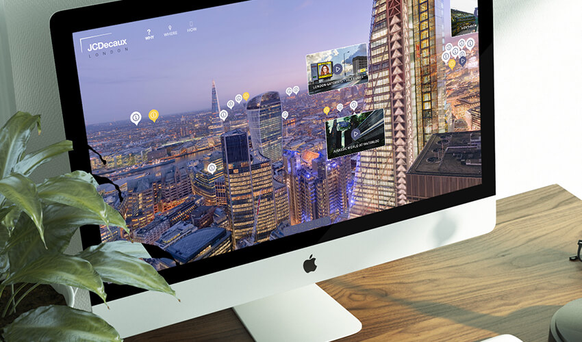
JCDecaux – London Digital Network
JCDecaux, the world’s largest and UK’s number one outdoor advertising company, commissioned us to build a dedicated website for their London Digital Network (LDN) campaign as JCDecaux took over the world’s largest bus shelter advertising concession in London. The standout feature amongst a variety of complex functionalities was a 360 degree panoramic gigapixel photograph of London, allowing the user to explore the city and dive into specific information about the different locations.
Bedford Modern School
Bedford Modern School is an independent day school for boys and girls aged 7 – 18, with a national reputation for excellence in the performing arts and sporting events. We worked closely with their marketing team to establish a bold and striking design concept that fitted their brand. We also used cutting edge development techniques such as the typing text effect on the homepage. Combined with fantastic photography, this resulted in a truly modern school website.
SI Partners
SI Partners is a global firm of management consultants and corporate finance advisors working to build better businesses in a range of sectors. With a concise set of key information to display, we decided against a traditional website structure and built a dynamic one-page website which allows the user to browse an overview of the entire content of the site without the need to navigate between pages. The focal point of the design was a full-screen image slider which we decided was the best method of communicating the client’s diverse and unique offering.
DON’T BE CONTENT WITH DESIGNING TO THE LOWEST COMMON DENOMINATOR. DO YOUR UTMOST TO GIVE EACH PROJECT YOU WORK ON A DISTINCTIVE CONCEPT THAT WILL ALLOW IT TO STAND OUT AGAINST ITS COMPETITORS.
Now you’ve nailed a killer concept for the website, you can move on to bringing the site to life in the sketching and wireframing phase. Check back soon for Part 2 when our designer Lietta will take you through the final stages of the TWK design workflow!


