The importance of visual identity for schools
Since our inception, we’ve worked with a huge breadth of schools. Our extensive portfolio showcases some of the great work we’ve done for our clients. In the competitive sector of education, standing out from the competition is crucial. Visual identities play a huge role in enticing prospective parents, and this goes far deeper than just a logo and colour palette. So how do we help our clients stand out? And how can we continue to develop so many unique brands within the same industry?
Understanding the school
A great visual identity should leave a lasting impression, whilst clearly communicating the nature of the brand. We have worked with schools that pride themselves on their traditionalism, whilst others have a distinctly more liberal ethos. Naturally, these traits translate into very different visual identities for each school. We always conduct an in-depth research phase with each school we work with. This helps us absorb the culture of the school and discover what makes it unique, thus fuelling our ideas for how we can differentiate it in the market. This research phase acts as the foundation on which we build the brand.
Producing the visual identity
After the research phase, the tone of the school will be established, this is when the design can commence. There are lots of elements that feed into visual identities, and it’s the confluence of these elements that determines the overall effectiveness of the brand.
Logo
A strong logo is the ultimate identifier of the brand. It creates instant recognition that is distinct to your school. Furthermore, it acts as a base that informs choices going forward. It can affect colour and typography, or it can even be converted into a brand mark used in promotional material. A great logo ultimately gives you options, is distinct, and fits with your school’s desired ethos.

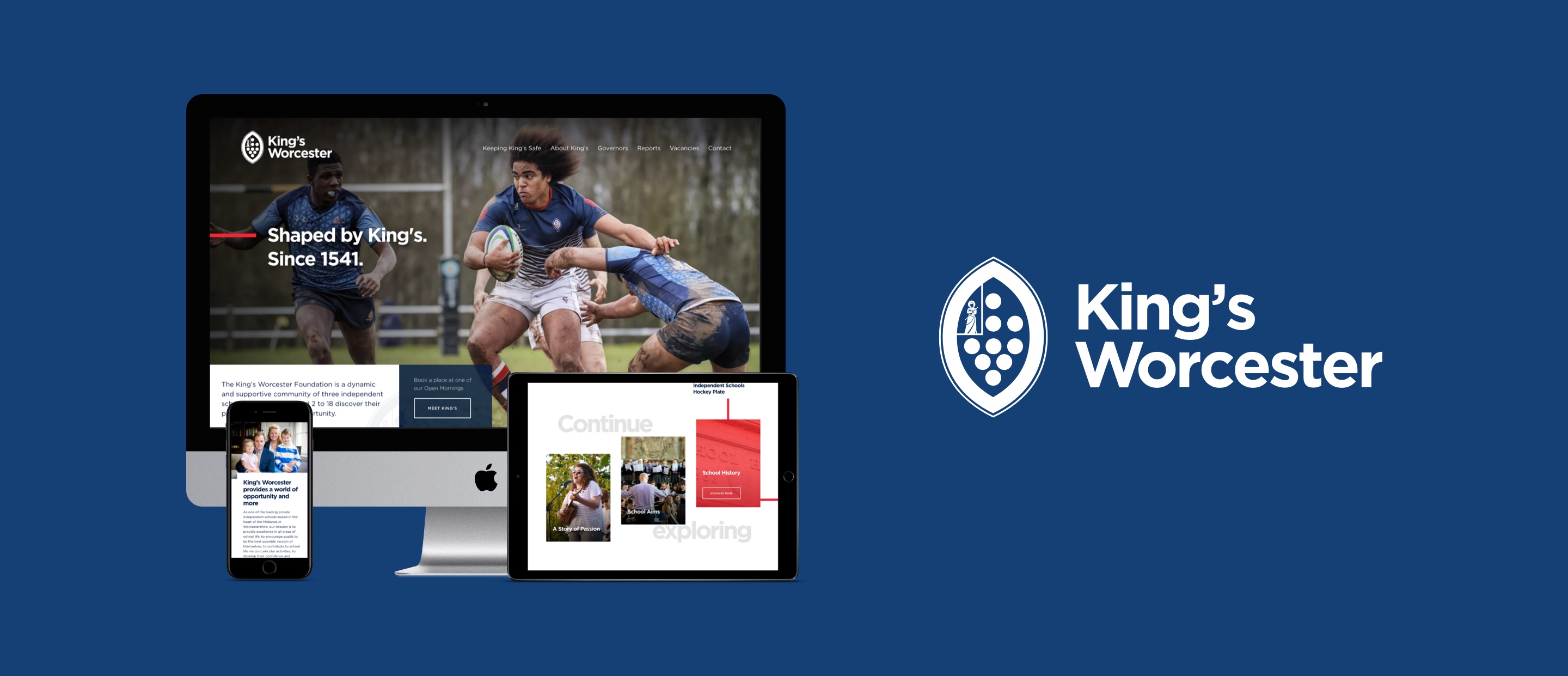
King’s Worcester – Branding, Website Design, Development, SEO, CMS, Mobile Website
Typography
This can often get overlooked, but the type of font you choose can also greatly influence how your brand is perceived. From a visual perspective, some fonts naturally look more professional whilst others look more playful. This is where it’s important to understand the audience – finding an interesting font that will still appeal to the demographic. It’s also worth considering accessibility when choosing fonts. It’s important to ensure your brand is inclusive, so picking a font that is too thin or cursive for people to read leaves a bad impression. Instead, try to pick fonts that are easy to read, and help communicate the personality of the school.
Colours
Choosing the right colour palette can be rather subjective. This is why understanding the school is essential. A new school wanting to be bold and punchy will need a very different palette to an established institution looking to uphold its traditions. If you use colours incorrectly you can end up with conflicting personalities, which is why it’s important to consider colour from the start to ensure all elements of the visual identity fit together.
Imagery and illustrations
Great imagery is essential in the education sector. Schools are selling lasting experiences for their students. It’s therefore essential that parents see authentic shots, so they can imagine their own child in that setting. Even the colour treatment feeds into the overall tone being communicated. It’s important these are all treated in the same way to ensure consistency across the brand. Illustrations can also be a great way to stand out – it’s good practice to tailor your illustration style to your demographic. For example, prep schools may be after a more hand-drawn style, whereas a senior school may wish to go for a more refined style to better fit the audience.
Conclusion
Standing out from the competition is crucial in all industries and the education sector is no exception. The key is to clearly understand the school’s aims and values in order to create a suite of assets that align with these beliefs. Our combination of knowledge, skills and enthusiasm for working in this sector make us perfectly placed to continue to produce groundbreaking school brands and websites.


