Creating website animations using Adobe After Effects
Over the past few years the web has become infinitely more vibrant, dynamic and interactive. At The Web Kitchen we are constantly searching for new techniques and approaches that will allow us to create ever more engaging experiences for users to enjoy. This of course comes to fruition once a developer gets stuck into building the website, however our design team also have the skills to bring animations to life.
Why do we animate websites?
Let’s start with the fundamentals. Why are website animations a good idea? Here are some of the reasons we do it:
Emotion
Should the website feel fun and playful? Slick and corporate? Somewhere between the two? Animations can be tailored to reflect the personality of the brand. This in turn should evoke certain emotions that make for a more meaningful and memorable experience.
Feedback
Small animations and micro interactions give feedback to the user when they perform a task on the website. This helps to guide them through their experience.
Focus
Clever use of animation can highlight calls to action or other important elements on the page. This helps the user understand where they should be focusing their attention. It also plays a significant role in increasing conversion rates and ensuring a seamless user journey through the website.
Impact
Loading sequences, parallax scrolling and interactive effects all aim to wow the user and leave a lasting impression.
How do our design team create website animations?
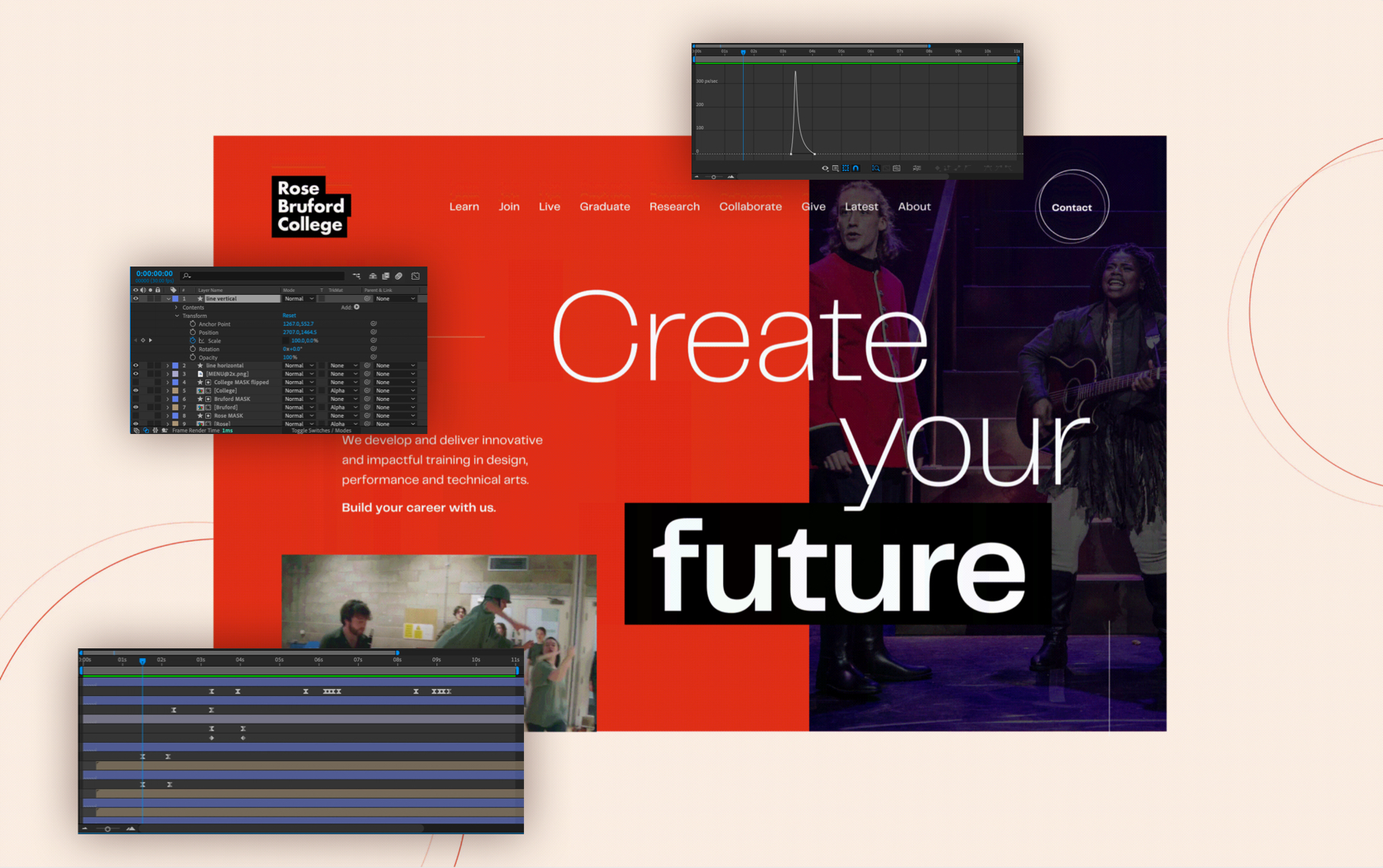
Once we have a great design, we then aim to bring this to life to get our clients excited about their new website. It’s also important to show the developer exactly how we envisage these animations working. Our design team use Adobe After Effects to produce a video of our animations. A developer can then watch this video frame-by-frame in order to understand how to replicate it perfectly in code.
Animation 101
There are a few important terms that are worth brushing up on if you want to understand more about website animations:
Layer
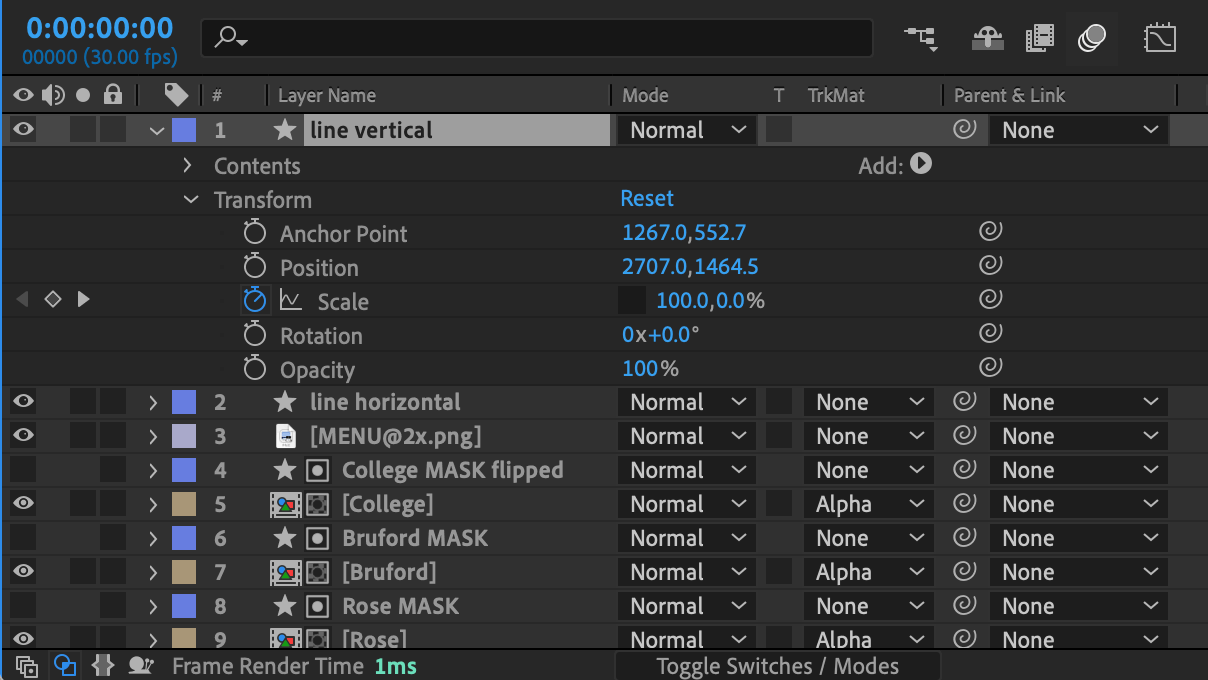
Each individual element of a design has its own layer in Adobe After Effects. The different properties of these layers, such as position and scale, can be targeted individually to build the animation.
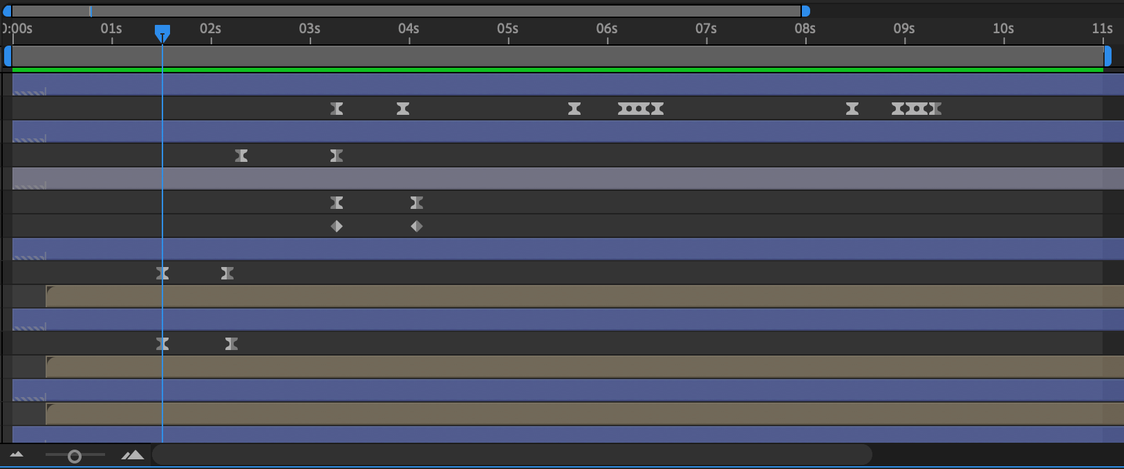
Timeline
This is the interface that allows us to set how each layer changes over the duration of the animation. Each layer has its own place within the timeline.
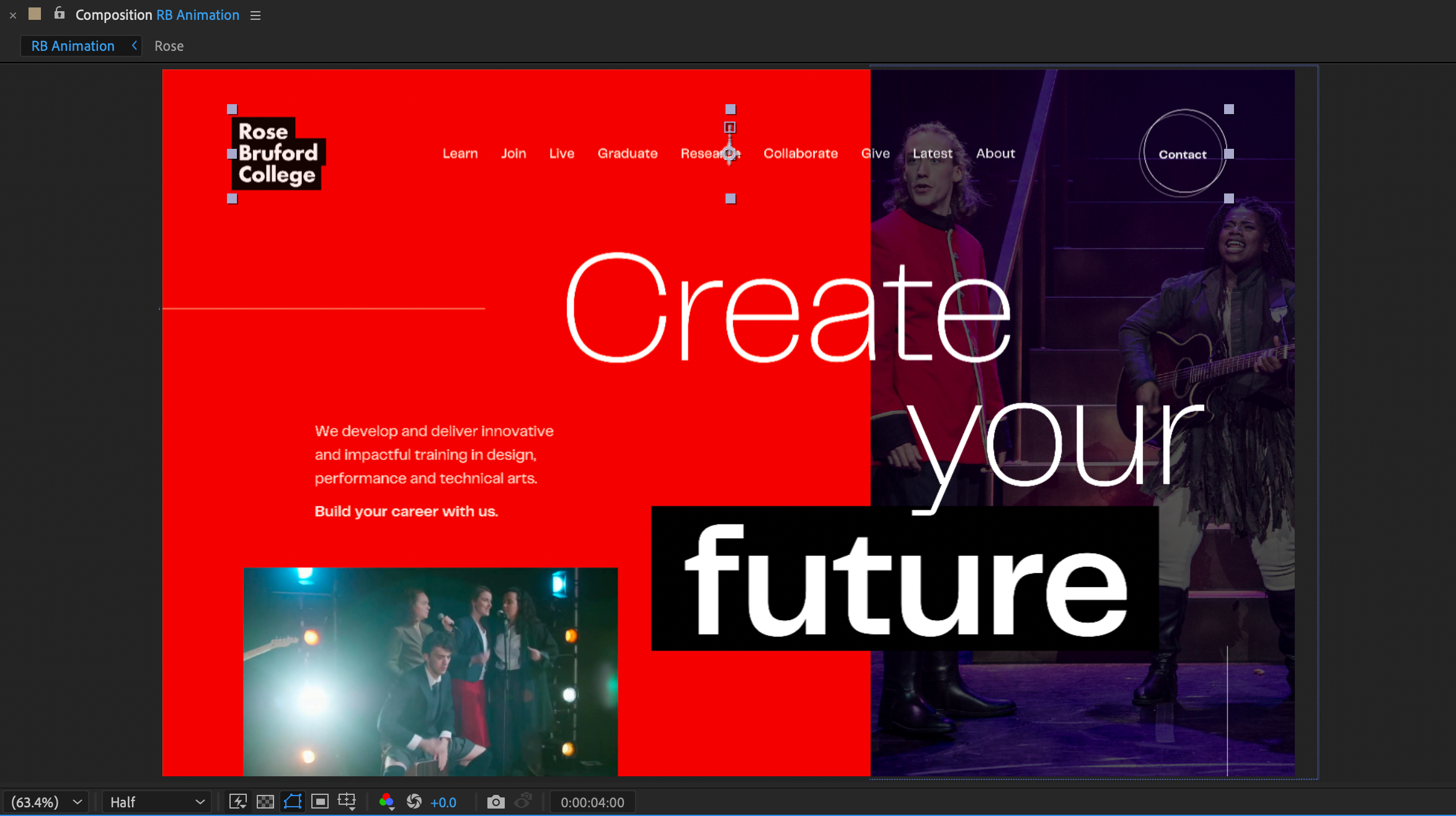
Composition
This is the canvas upon which we build the animation.
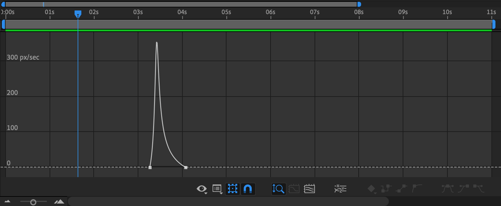
Easing
This is the way in which elements within the animation accelerate and decelerate. Easing is extremely powerful as it plays an important role in determining the ‘feel’ of the animation.
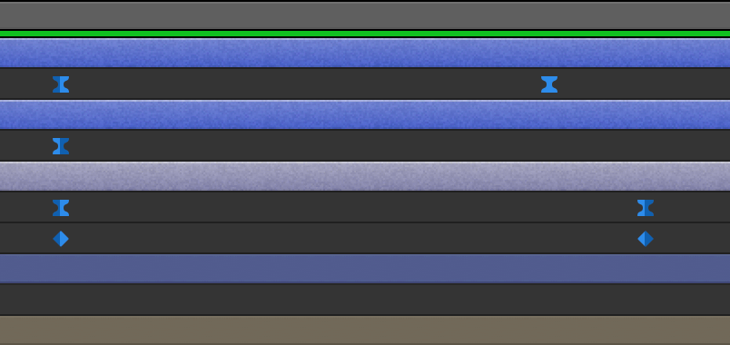
Keyframe
A defined moment in the timeline from which a specific animation is based. For example, an element that takes three seconds to move from Point A to Point B would need a position keyframe at the beginning of the animation, and another three seconds later in the timeline.
Render
The process of turning our Adobe After Effects compositions into video files. This is achieved using Adobe Media Encoder.

Creating our website animations
It’s important to have a solid understanding of how the final website will be built and what limitations there are before we start animating. Not everything that is achievable within Adobe After Effects will be possible to replicate using HTML, CSS or even Javascript or other libraries. Talking the animation ideas through with a developer before starting is the safest way to ensure we don’t waste time animating a concept that is too complex to achieve.
So, we’re ready to animate! Here are a selection of effects and techniques we use, along with examples of how we have implemented them in our recent projects:
Fade in
Animating the opacity of elements in our designs gives that classic fade in/out effect. This is one of the simplest effects to implement as we don’t really need to worry about easings. Playing with the length of fade animations can result in either a sharp/sudden reveal, or a smooth/gradual fade out. Although there are also complex masking animations happening on the Bruford College homepage, the use of a simpler fade-in effect for the menu, logo and other secondary elements creates a clear visual hierarchy to ensure the user focuses on the most important elements:
Swipe reveal
A big personal favourite for the modern, edgy feel it gives. Easing plays a huge part in conveying the appropriate tone of voice. A smooth ease-in gives a sense of drama, whereas a faster ease-out transition feels more slick and punchy. The swipe reveal effect works especially well with imagery and videos as the website can load those elements in the background whilst hidden. They can then be unveiled at the opportune moment. The Diocese of Southwark homepage goes for the more dramatic ‘curtain-reveal’ effect to mimic the movement of the tagline, with the image then growing on scroll too for a seamless transition into the homepage content:
Masking
Animating masked elements provides an excellent opportunity for creativity. At The Web Kitchen, we often use masking as a way to reveal text as it can give a real sense of movement and purpose to your typography. It is also a really helpful solution for making elements appear from nowhere, rather than having to slide in from off-screen which can be extremely limiting. The circular motif throughout the Pennthorpe School website is used as a mask to reveal the translation of the tagline in the loading sequence, as well as revealing the images in the homepage carousel:
Animated text
It’s possible to give text it’s own personality by animating the letters themselves. This is a really important one to check with a developer about. That said, many text properties such as letter-spacing and variable font-weights can now be animated using code. The TextEvo2 plugin is really handy for automating a big part of the animation process here. The letter-by-letter animation in the Sea Mirror menu exudes luxury, much like the properties themselves:
Line drawing
Animated SVGs allow us to add movement to icons, illustrations and other graphical elements on a website. Animating a ‘trim-path’ in Adobe After Effects mimics this effect perfectly, as shown in this homepage carousel we produced for the National Centre for Universities & Business:
Summary
Animation has become one of the most important aspects of web design. Through research and experimentation, the power now lies with our design team to ensure that the creative visions for our animations come to life in the way we intend. We have the skills and knowledge to create high quality animations that improve our team’s workflow, impress our clients and ultimately produce richer online experiences than ever before.


