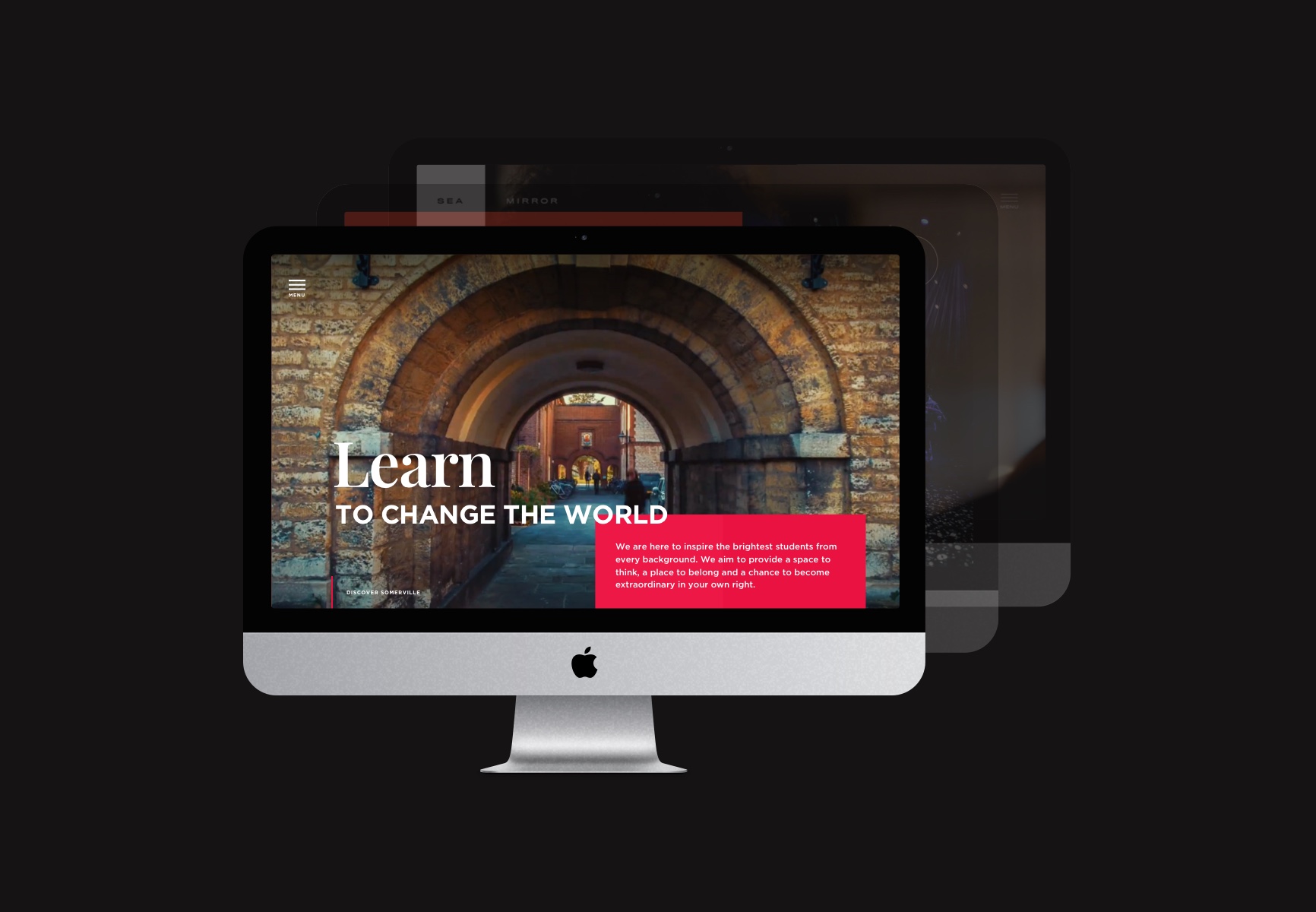
Creating the perfect header
In design there’s never a one size fits all approach, there are infinite ways to create something visually impactful without confining yourself to one style. That being said, there are some best practices to ensure your header is as strategic and creative as possible, thus creating the perfect header.
What is a header?
First of all, a header refers to the top of a website page. The purpose of which is to clearly outline the content within the page/website and let visitors know what they can expect from the site. This is the first thing a user will see, which means making it visually striking is as important as unpacking the key content within the fold. The synergy of these two parts is what creates a perfect header.
What should be featured in the header?
This is largely dependent on the industry of your business, but there are some common areas that are consistent across the board. These include:
Navigation
Every site should have a seamless navigation that allows users to find what they’re looking for quickly and easily. There are lots of ways to house these including: a conventional navigation, hamburger menus, super navs etc. The number of pages in the sitemap largely dictates which is the best approach to use, but all are solid options if executed well.
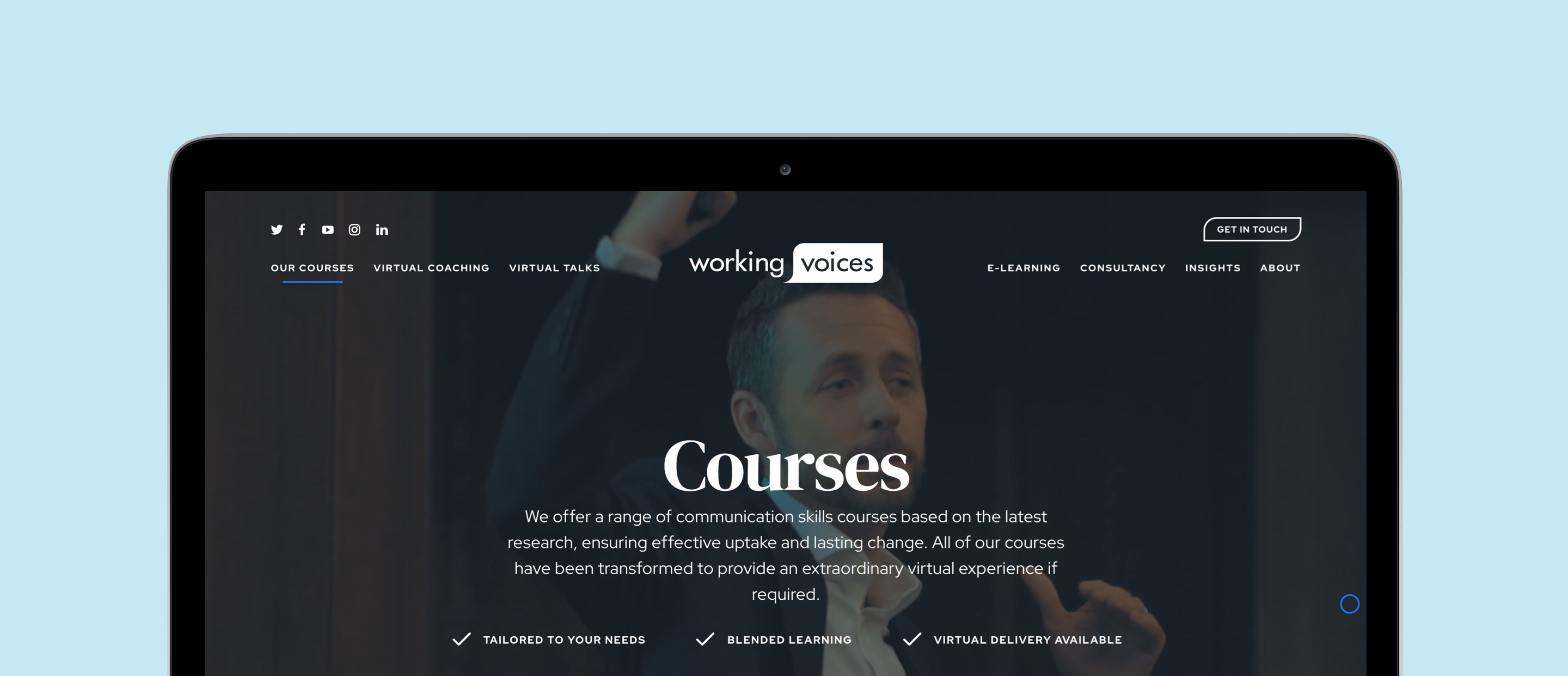
Working Voices – Design, Development, SEO, CMS, Mobile Website
Logo/name
Another essential is the brand name and logo. A user must instantly recognise where they are, so placing this at the top of the homepage creates that instant brand recognition. The position can vary between designs, primarily for stylistic reasons. It’s commonly found in the top left, but don’t let this discourage you from experimenting with other placements.
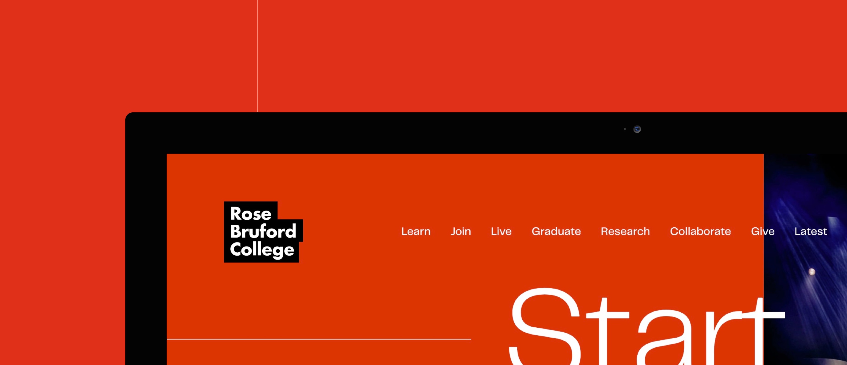
Rose Bruford College – Design, Development, SEO, CMS, Mobile Website
Engaging introduction
You’ve got to assume every visitor knows nothing about your company. Therefore, outlining what you do through the use of copy and imagery is essential for a visitor to decide to continue to interact with the brand.

Pennthorpe School – Brand Assets, Website Design, Development, SEO, CMS, Mobile Website
A call to action
Whilst all websites have different end objectives, they should all aim to have as much interaction with the visitor as possible. Therefore, having one clear call to action is a great way of reducing bounce rate by giving them the next piece of information. This call to action could be as simple as ‘Scroll down’ on a content focused website. Alternatively, if the website is in the ecommerce space, including a best selling product and a link to the detail page could be a great idea.
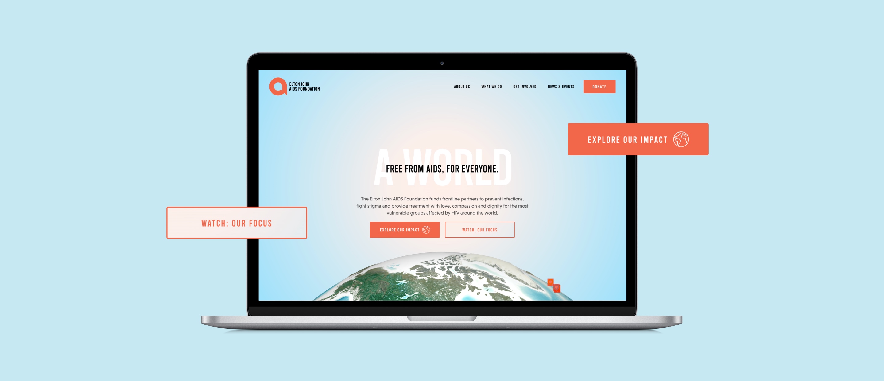
Elton John Aids Foundation – Design, Development, WebGL animation, Mobile responsive website, SEO, CMS
Creative
Adding creative flair to your website has never been so important. Visitors spend an average of 15 seconds on a site, so capturing their attention is key to reducing bounce rate and keeping them on your page – a strong creative concept can do exactly that. There are many ways to achieve a unique & perfect header, but some great assets include: photos, videos, illustration & WebGL. When these are paired with animation this can create a really slick experience that encourages visitors to click around the site. To view some great examples check out our portfolio.
Sea Mirror – Design, Development, SEO, CMS, Mobile Website
Ensure it’s responsive
In a world where 54% of internet users are browsing via mobile, having a site that looks great at every device size is a must. Although the screen obviously becomes smaller, it’s important the header packs the same punch as the desktop site. Elements may have to get hidden to allow all the most important aspects to stand out within the fold, this is where content hierarchy comes into play. Understanding what your visitors want to see first, is the key to a great header.
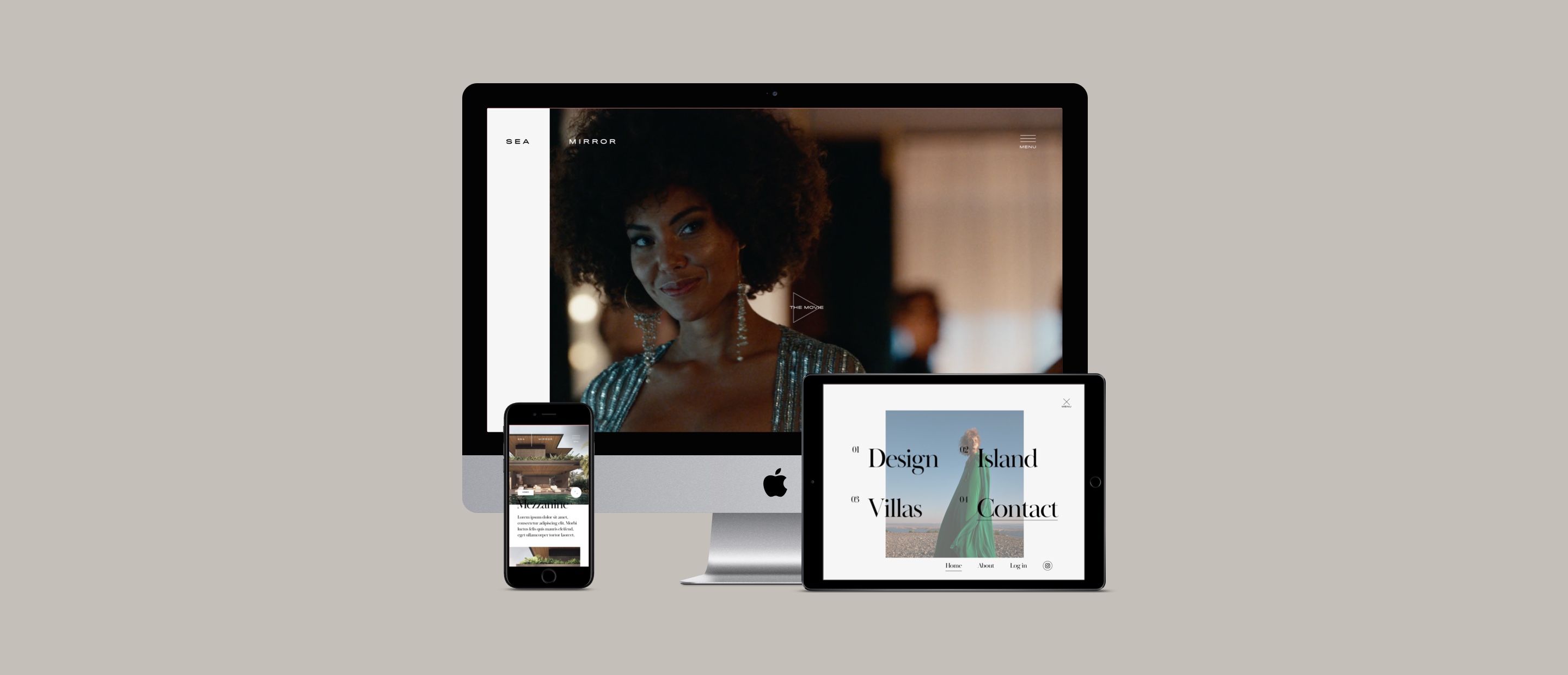
Sea Mirror – Design, Development, SEO, CMS, Mobile Website
Conclusion
So creating the perfect header is possible? It absolutely is, although it’s important to follow these core principles whilst designing your header. Equally, don’t let this hold back your creativity, it’s okay to experiment with the positioning of these elements – provided they are there. After all, that’s how we keep our sites unique, and interesting.


