Top web design trends for 2022
2022 is the year of revival. It’s the year we get our lives back and it’s the year design trends are thrown back to the 90s.
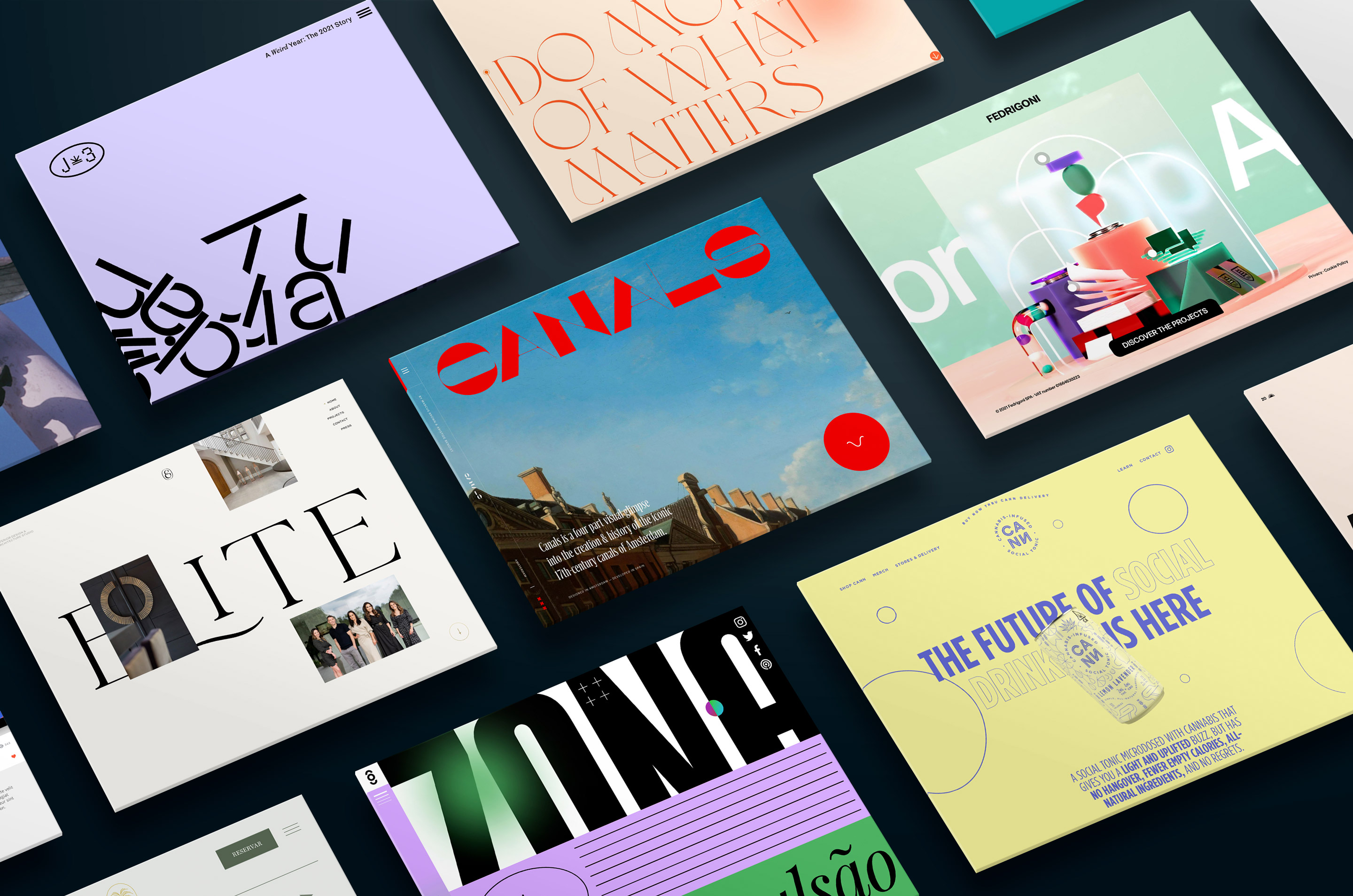
Creatives are designing outside the box and leaving the grid behind. Exaggerated typography, retro graphics, and muted colour palettes create engaging websites that are all about the finer details. As web design moves into the future with advanced interactions and visual effects on the rise, it’s important that here at The Web Kitchen we stay on top of the trends.
Let’s take a look at the trends shaping 2022 so far.
Go big or go home
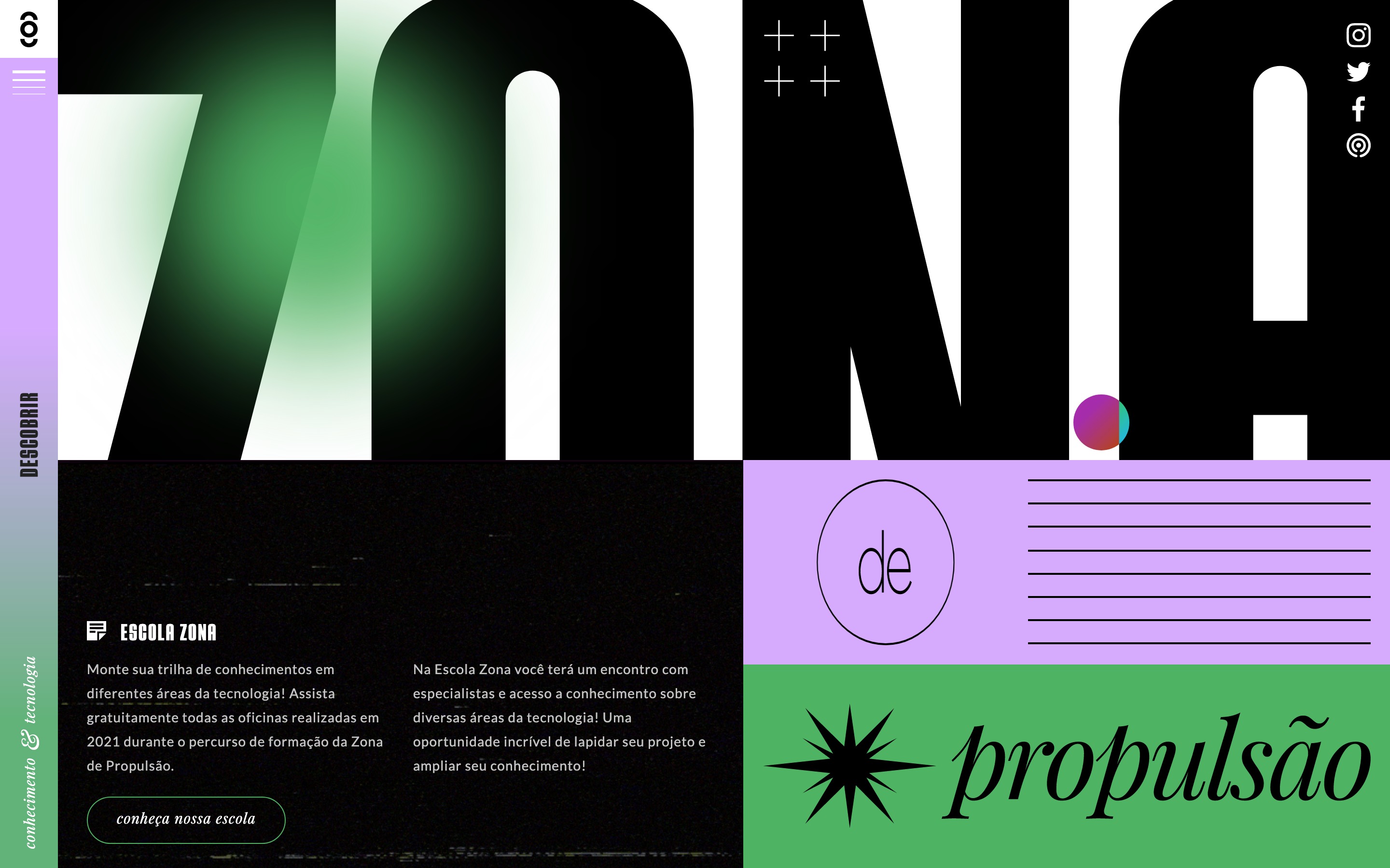
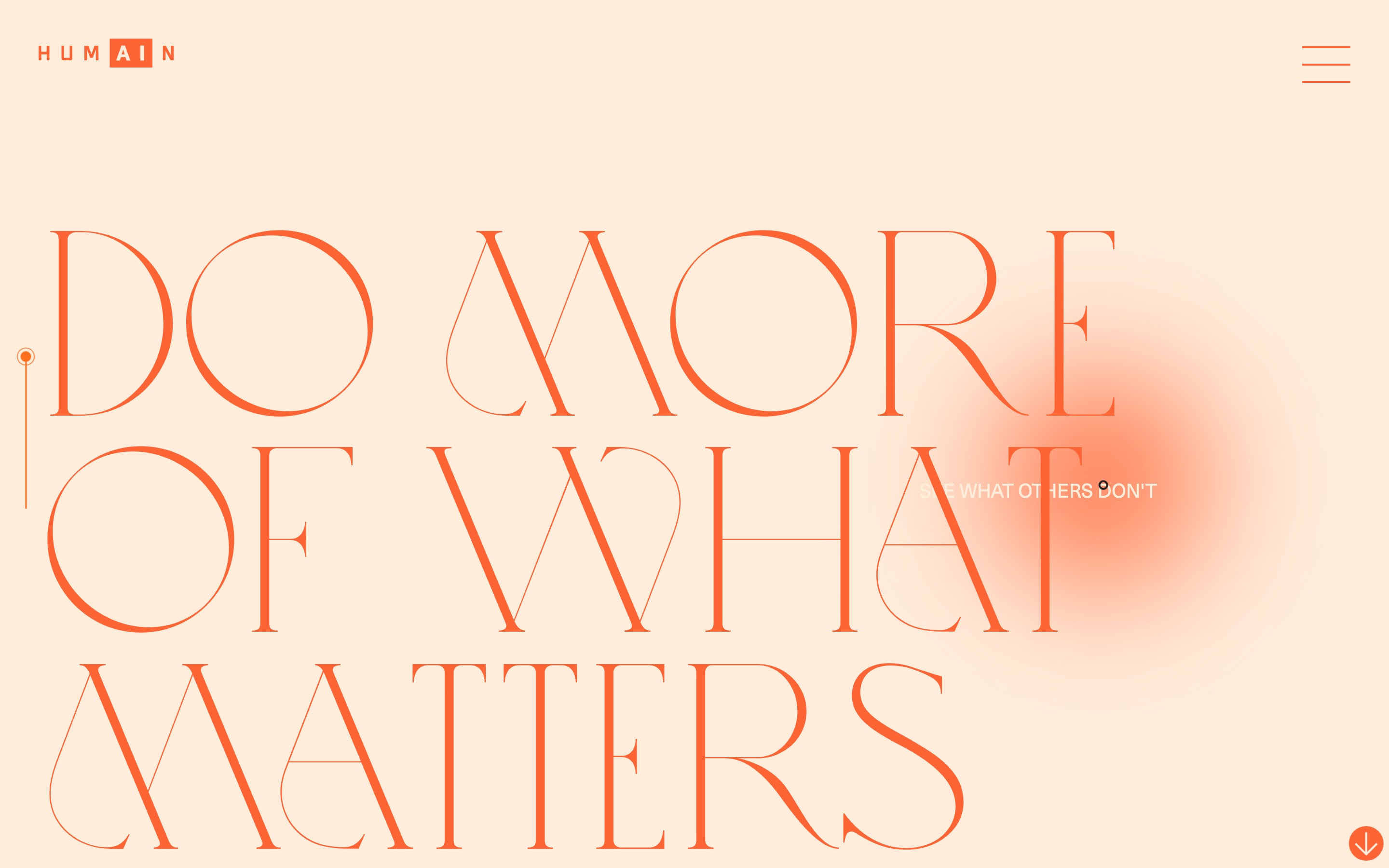
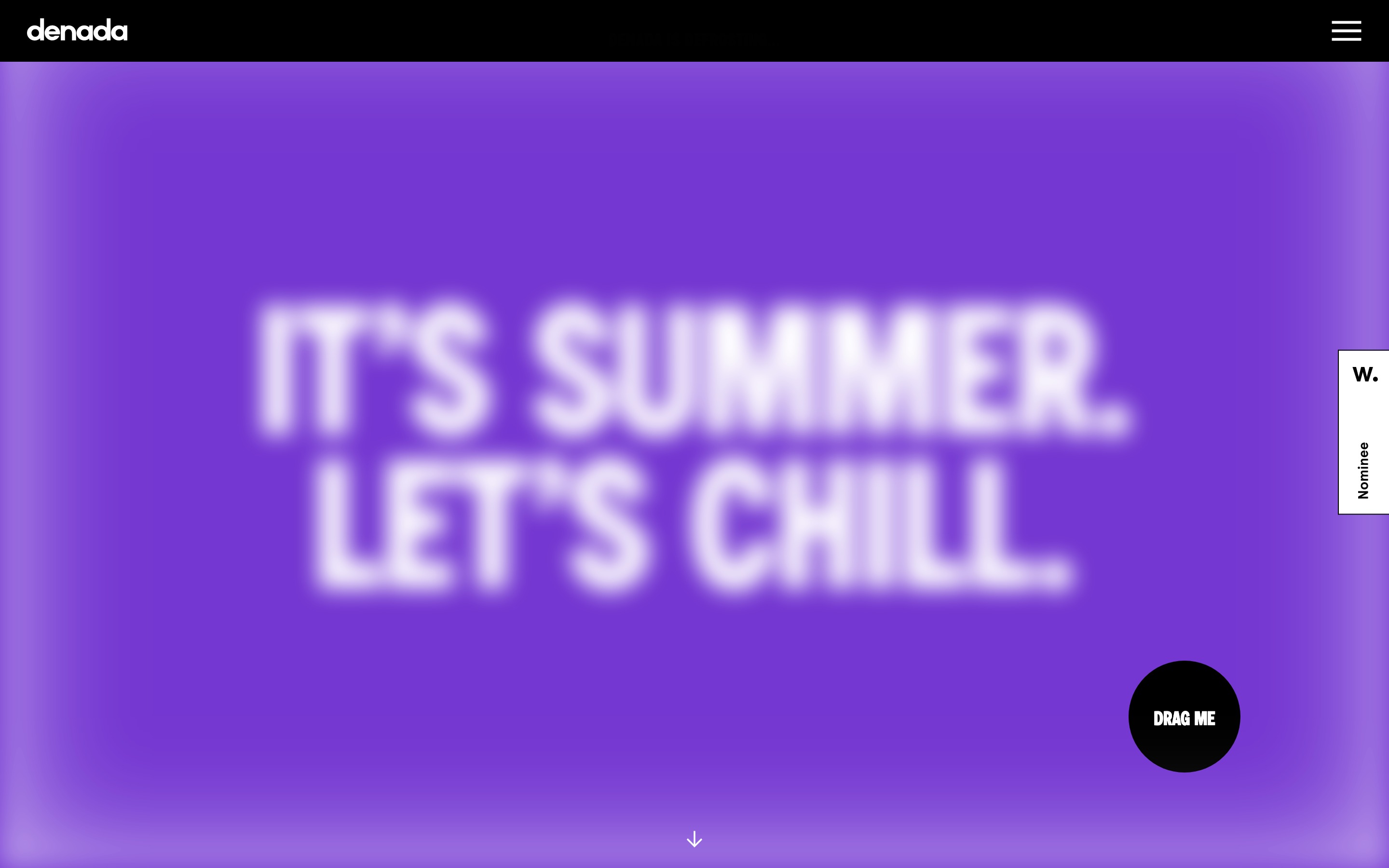
Forget the photo-centric layouts of the last decade. This trend is all about oversized typography – the bigger the better! When used at an unusual size it becomes a graphical element rather than just part of the copy. Many designers are choosing to create hero sections and landing pages that let the content speak for itself. By eliminating other distractions such as imagery and illustration, this technique attracts attention and guides the user’s eye down the page. Expect to see brutalist style fonts, interactive typography and stripped back colour palettes.
Homepage for Descobrir
Homepage for Humain
Homepage for Denada
The retro revolution
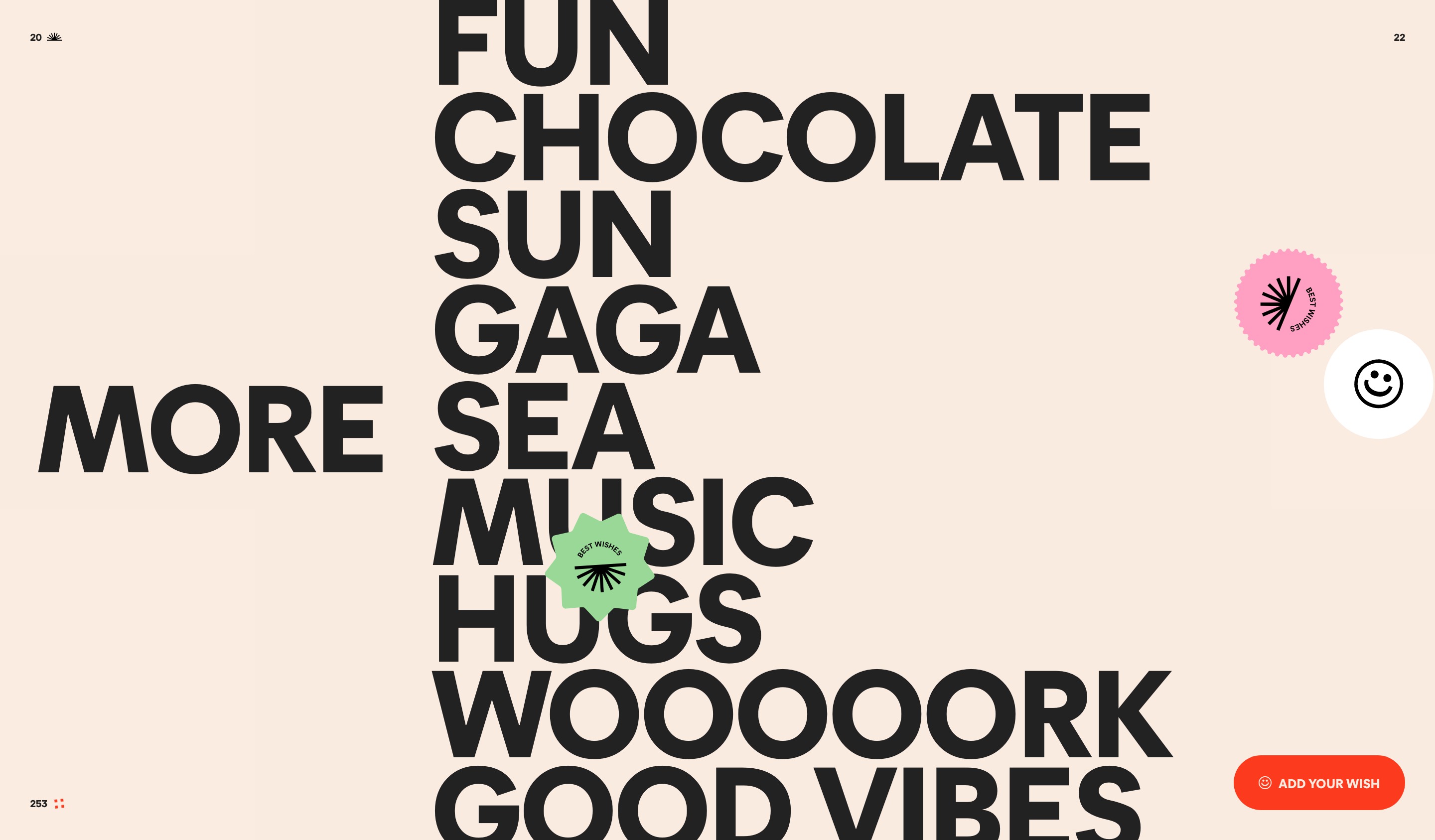
The past year has seen the 90s making a comeback across fashion and music so it was only a matter of time before it took over web design too. The last two years have been filled with uncertainty, drawing us to the comfort of our favourite technologies and brands of the past. This purely aesthetic trend combines memphis design features such as pastel colours and geometric shapes with grainy textures and framed images to create tangible experiences that feel familiar. Simpler interfaces, simpler times.
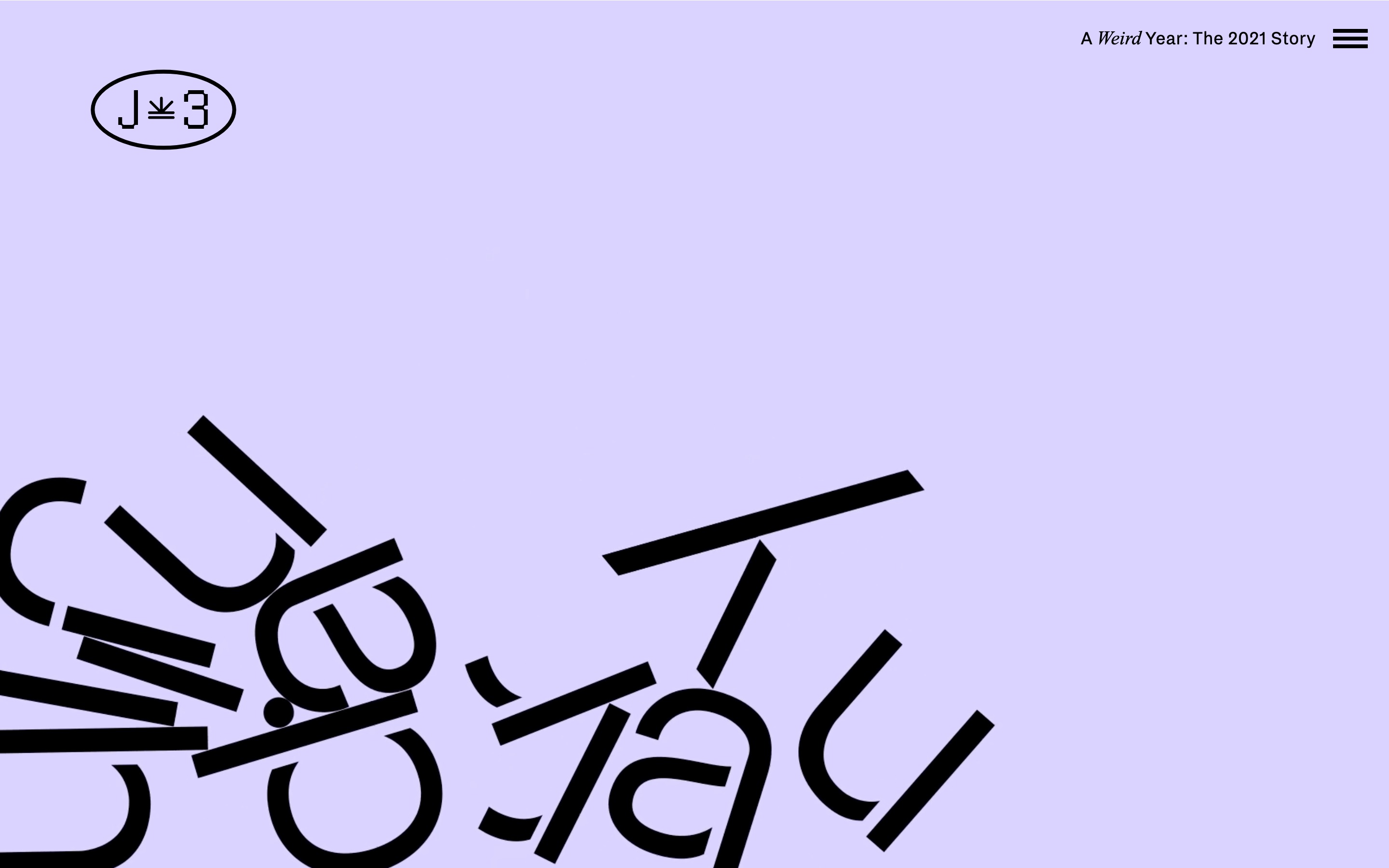
Homepage for January 3
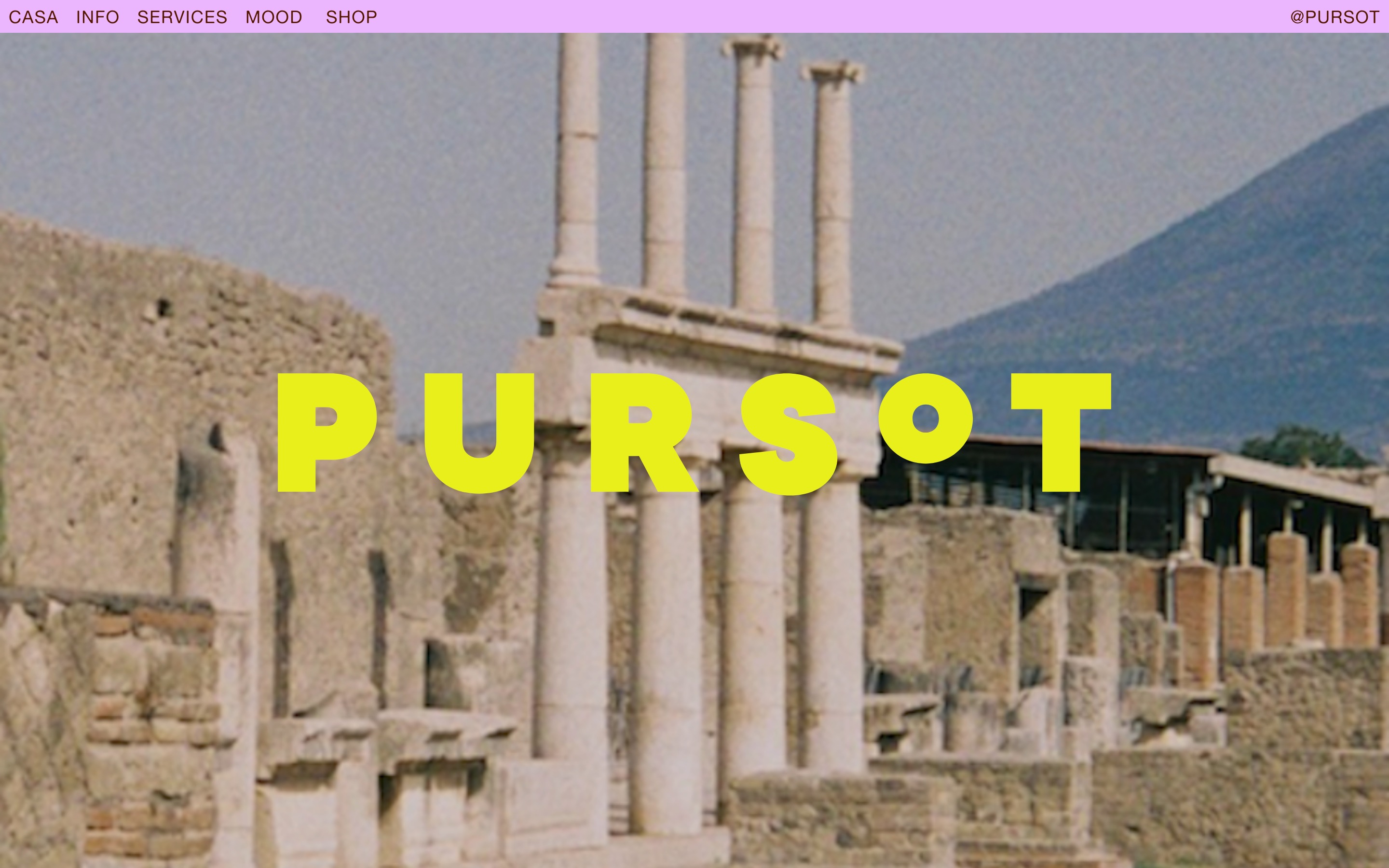
Homepage for Pursot
Scrolly telling
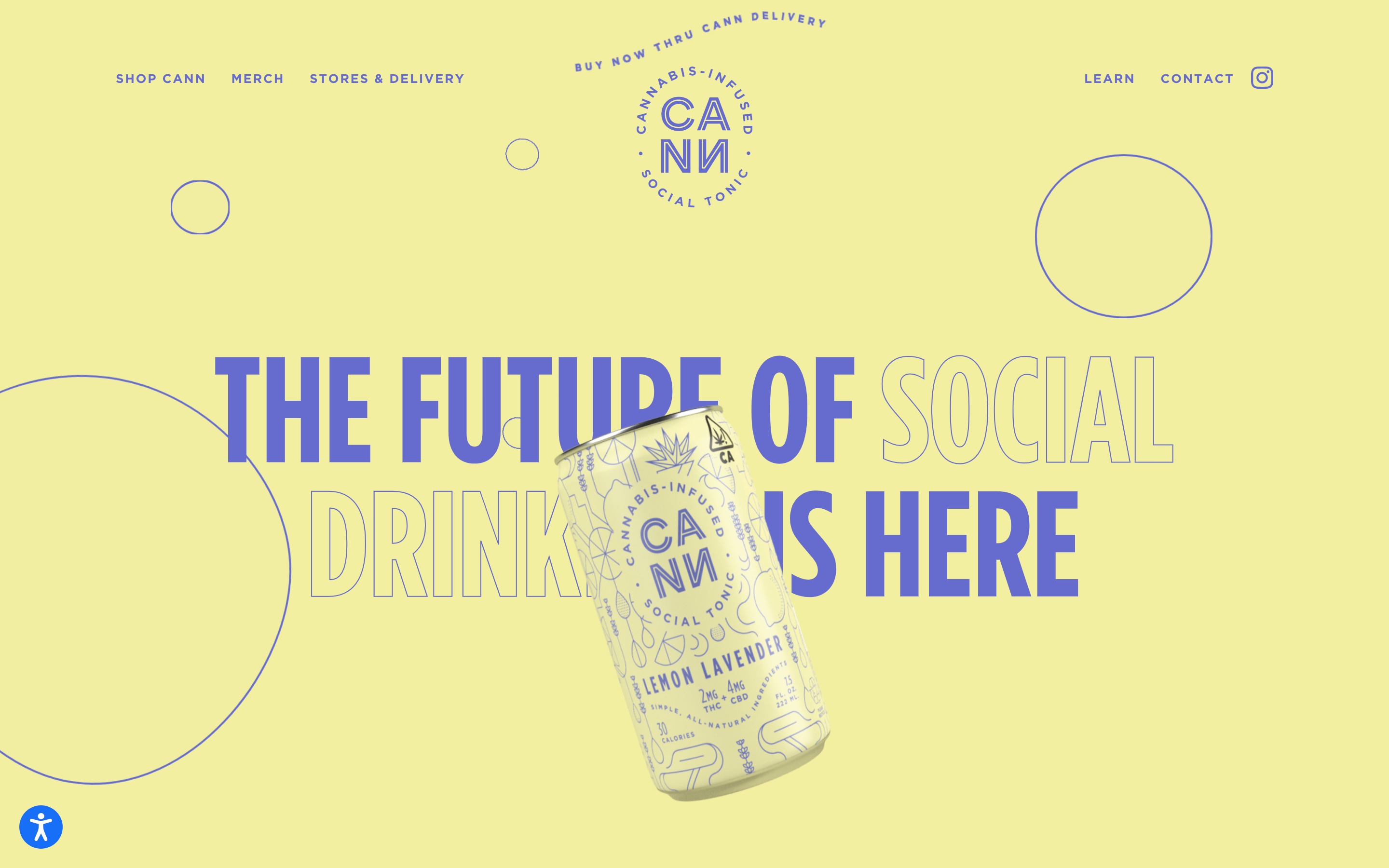
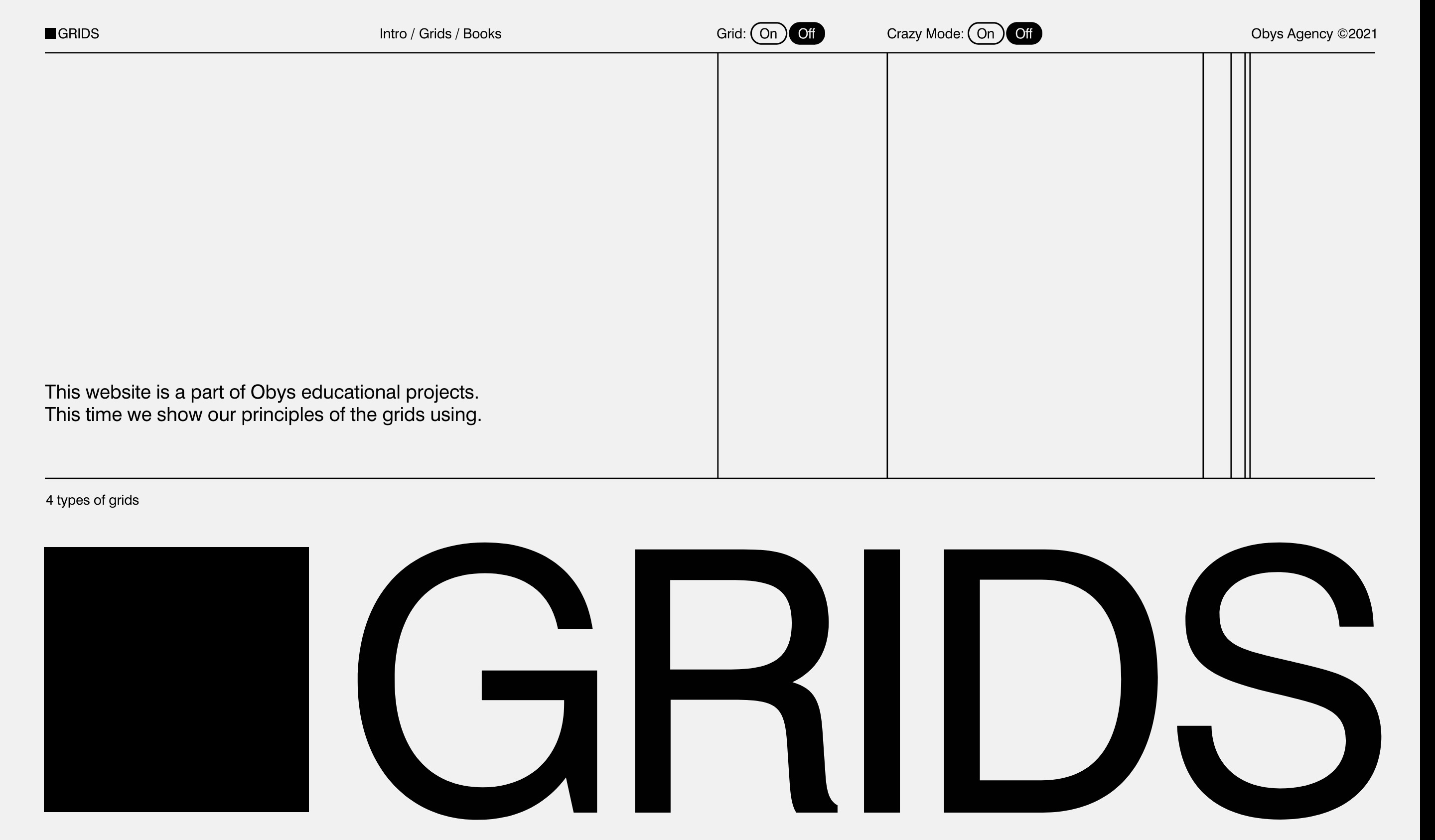
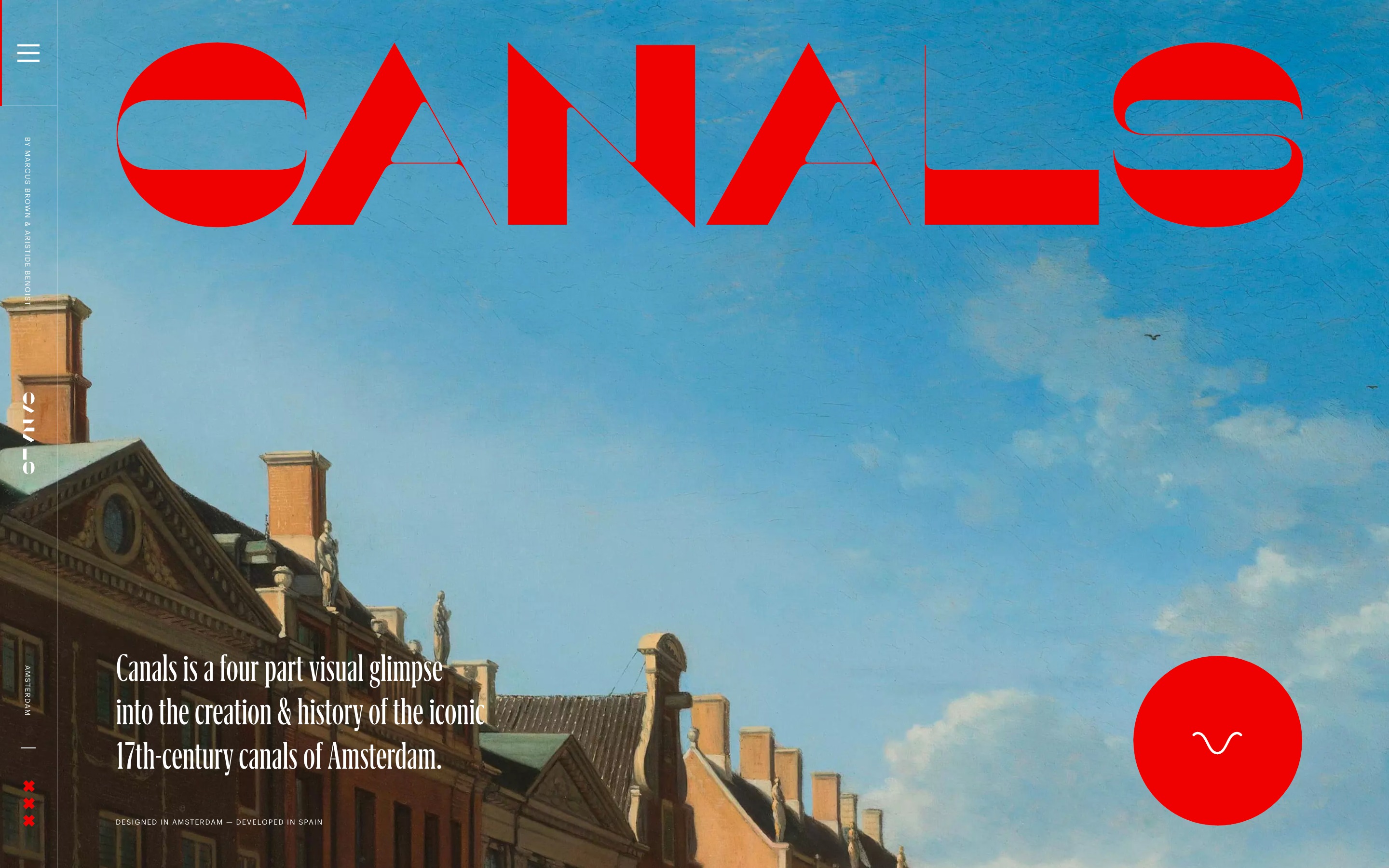
Scrolly telling, also known as narrative visualisation, is an increasingly popular way to elevate user experience and take users on a journey of discovery. Long scrolling pages with smooth transitions and interactive elements encourage users to take in content at their own pace, controlling the flow and navigation. By displaying messages in intriguing ways it drives users to keep scrolling, whilst presenting them with surprising interactions between text, image and colour. Horizontal scrolling websites are also increasing in popularity, pushing the trend one step further to create fun, memorable experiences that challenge users’ normal viewing experiences. Scrolly telling is the perfect trend for portfolio websites, maps, timelines and online galleries where the aim is to amaze and intrigue through individual experiences.
Homepage for Cann
Homepage for Obys Grids
Homepage for Canals
Keeping it classy
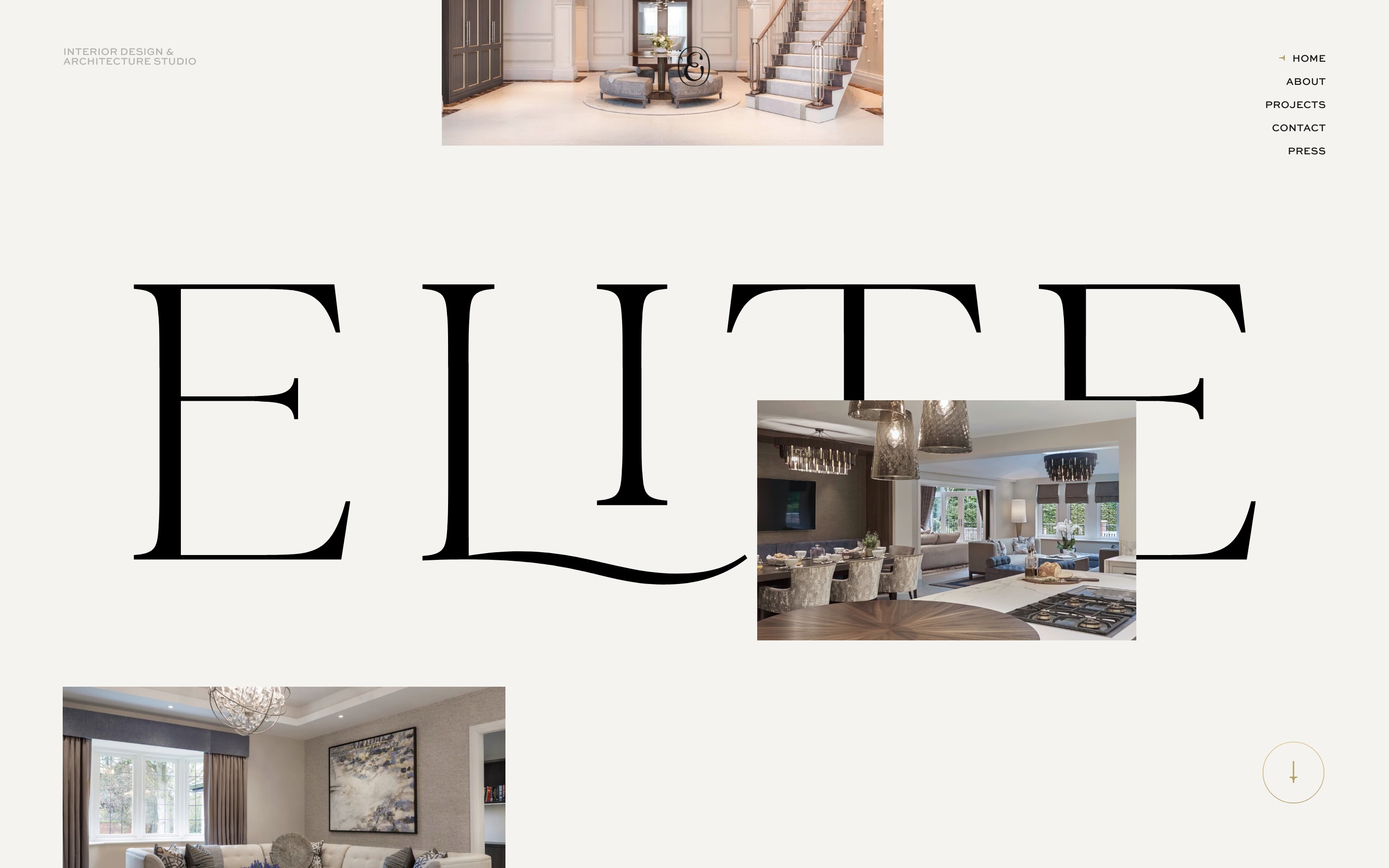
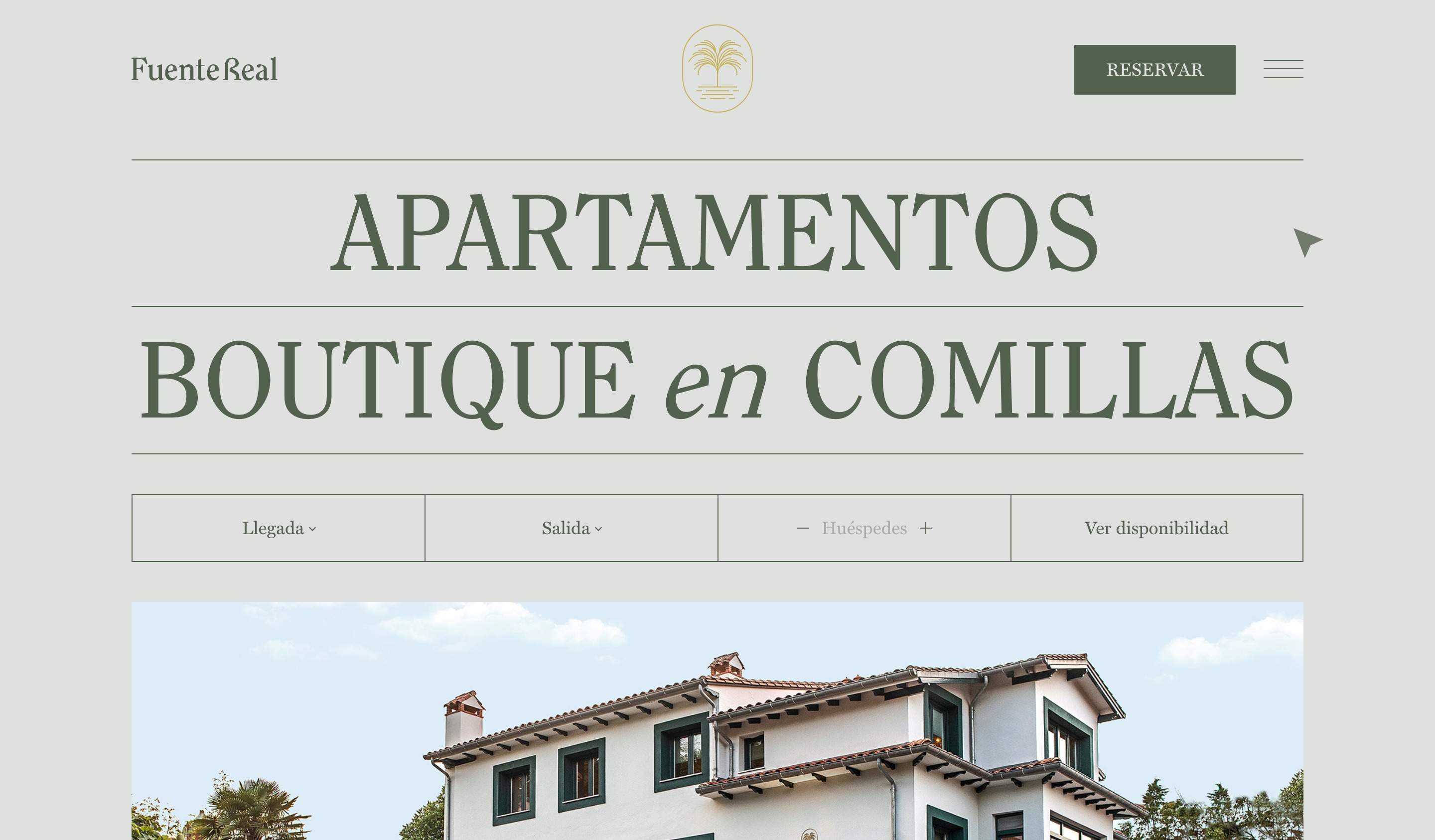
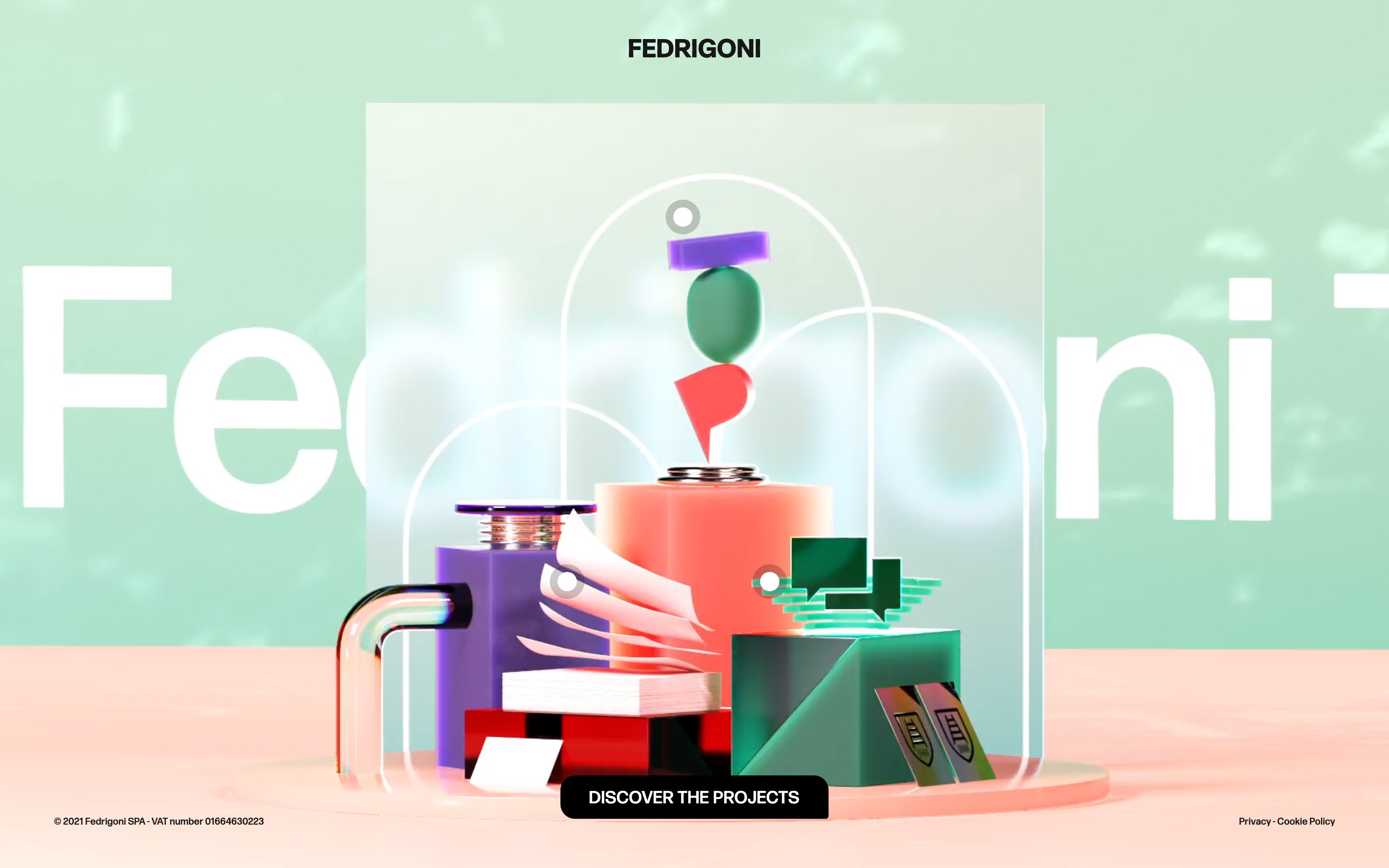
Compared to other trends in 2022, this one takes design back to basics. ‘Keeping it classy’ is here to inject a sense of calm onto the web design scene after the turmoil of the last two years. Colours used are easy on the eye, fonts are legible and designs are minimalist in style. The trend pairs classical serif fonts with earthy colour palettes, flat designs, and glass-morphism effects. The results are modern, sophisticated and refined designs. The iridescent, blurry backgrounds of glass-morphism are set to dazzle users with their diamond-like qualities whilst paper-like textures, muted colours and sharp edges create a recyclable aesthetic. Both create elegance, high contrast and tangibility through their handcrafted quality and sophisticated typography.
Homepage for Elite
Homepage for Fuente Real
Homepage for Fedrigoni
Final thoughts
It is clear to see from the examples that the trends this year are versatile, with many designers choosing to combine styles in order to find the perfect balance between brutalist typography and sleek, earthy aesthetics. All of this whilst ensuring users are familiar with the interface by making websites interactive yet easy to consume. 2022 is definitely something to look forward to and we are excited to put these trends into action ourselves. Why not check out our portfolio to keep up to date with recent project launches.


