AN EXCITING YEAR AT THE WEB KITCHEN
Here at The Web Kitchen, we have gone through some significant changes in 2014. From moving to our shiny new London office in W1, to implementing our own brand and website refresh – here’s a run down of what we’ve been up to and why…
Moving to W1
From humble beginnings working in our cafe/studio in Shepherds Bush, The Web Kitchen has grown into a highly capable, creative and technically-proficient web design agency. Add to this a wide-ranging client base – from leading independent schools such as Sherborne School to global corporate clients like News International – and it is clear to see why moving to central London was a natural progression for us. Being a stone’s throw from Oxford Circus means we are now much more accessible to our clients, whilst also giving us the perfect base to provide the personal service we have become known for.
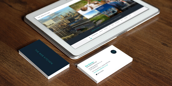
The new brand
As a creative web design and development agency it can be all too easy to let client projects consume you, leaving little time to give your own brand and website some tender loving care. No matter how successful you are, it is important to never underestimate the importance of keeping your brand fresh and engaging.
Your brand is your identity. It is a representation of who you are and what you stand for as an agency. At The Web Kitchen, our brand had always been unique yet understated, allowing our work to do the talking. As a web design agency we felt it was vital to stick to these morals in the new brand as we will always be judged on the quality of our websites above all else. The main priority was to refresh the look of the brand to ensure it sits comfortably alongside the established and reputable clients we now work with. The result was a crisp, modern logo and accompanying brandmark that reflect the clean lines and precision of the websites we design and build.
The new website
For a web design agency, your website is much more than just your shop window. Of course it is often the first opportunity you have as a company to make a positive lasting impression on potential clients, but more importantly it is the visualisation of your philosophy as a creative agency. It is your agency in a nutshell. This can be a daunting prospect for a creative team to tackle, but it is also an excellent chance to clarify what the key principles of the agency are.
From doing a vast amount of research in the sector (something we do on a daily basis anyway!), it is quite easy to see the current trends among other web design agencies. Here are our top 3 clichés used by web design agencies across the world that we chose to steer well clear of…
Infographics showing the number of flat whites consumed this week.
The use of counters and statistics for meaningless information is rife among creative agencies. Luckily we don’t drink much coffee at TWK which is a handy excuse to give this wince-inducing trend a miss.
Quirky ‘meet the team’ pages that include favourite films, number of pixels pushed, and a profile for the office pet.
At TWK we have an interesting and diverse team with a broad range of skills and outside interests. However we know that most people don’t have the time to indulge in such information whilst browsing our website so we prefer to keep things relevant.
Overused catchphrases about ‘passion’ and being ‘not just a web design agency’.
At The Web Kitchen we aren’t big fans of marketing speak. We design and build websites so its best to let them do the talking rather than us!
With these key things in mind, we decided that the best way to capture the essence of what we do would be to exhibit the prestigious clients we work for and the impressive array of websites we have produced for them. We have an extensive portfolio of work across a wide range of sectors and we know that this is what our website visitors will relate to, not gimmicks or catchphrases. Our focus was on a clean, elegant design that gives us the platform to show off what we do best – something we hope you will agree we have achieved.


