How illustration can transform a brand
65% of the world’s population are visual learners* meaning more than half of us absorb information best when in visual form. Too many companies lack individuality when it comes to their visual identity, relying on generic stock imagery or basic icons to differentiate their identity. This results in uninspiring brands that many of us struggle to empathise with. When information is paired with stimulating illustration in branding, animation or photography it is more relatable, understood quicker and the brand’s overall message is clearer.
At The Web Kitchen we have experience in helping clients to place illustration at the forefront of their identity. The result is personable, engaging brands which stand out from their competitors. Illustration in branding can transform the tone of voice and therefore the target audience. The examples below include websites created by us, in which we use illustrations to boost visual identities. Whilst the purpose of each illustration is different for each client, they all achieve the same goal of adding distinguishable elements, and helping our clients stand out.
To inform
When designing for an international company, images can be more powerful than words. Illustration in branding is a way of communicating specialist information through visuals alone. An example of this is SafetyKleen, the world’s leading parts cleaning company. We executed both their website and created an explainer video, highlighting what they offer in a concise and digestible way. It was important to transform the male dominated, jargon heavy industry into something relatable, interesting and easy to understand for all. Using minimal, cartoon-like illustrations in an informative way, allowed us to simplify concepts and convey a clear message to users around the world.
SafetyKleen – Animated explainer video
To narrate
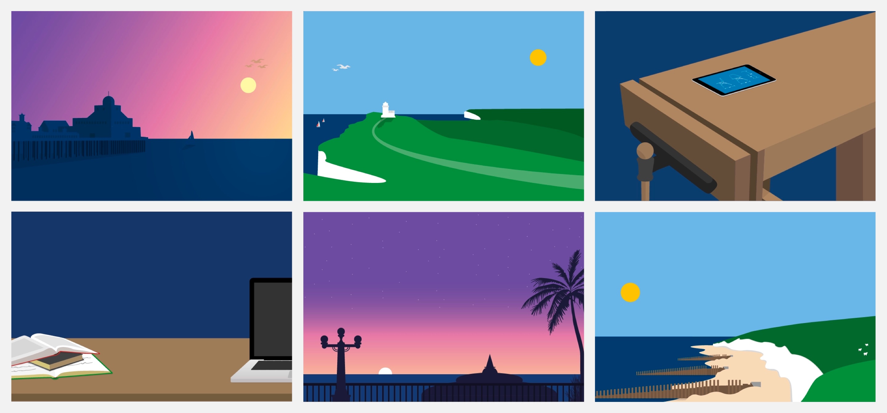
Illustrations are a storytelling device, which captivate the audience at a glance. Visuals help break up content heavy websites, keeping the audience engaged through changing communication styles. Using illustration to form a clear narrative was something we were keen to incorporate into Eastbourne College’s brand. In order to differentiate our client from their competitors we chose the schools stunning South Coast location to be their USP (Unique Selling Point). Digital full-frame illustrations throughout the site highlight this location, and the impact it has on their students. Combining block colours and soft gradients results in magical looking landscape illustrations. Subtle animations such a flying birds or moving clouds creates further intrigue and capture the audience’s attention helping the school’s idyllic setting come to life.
To personalise
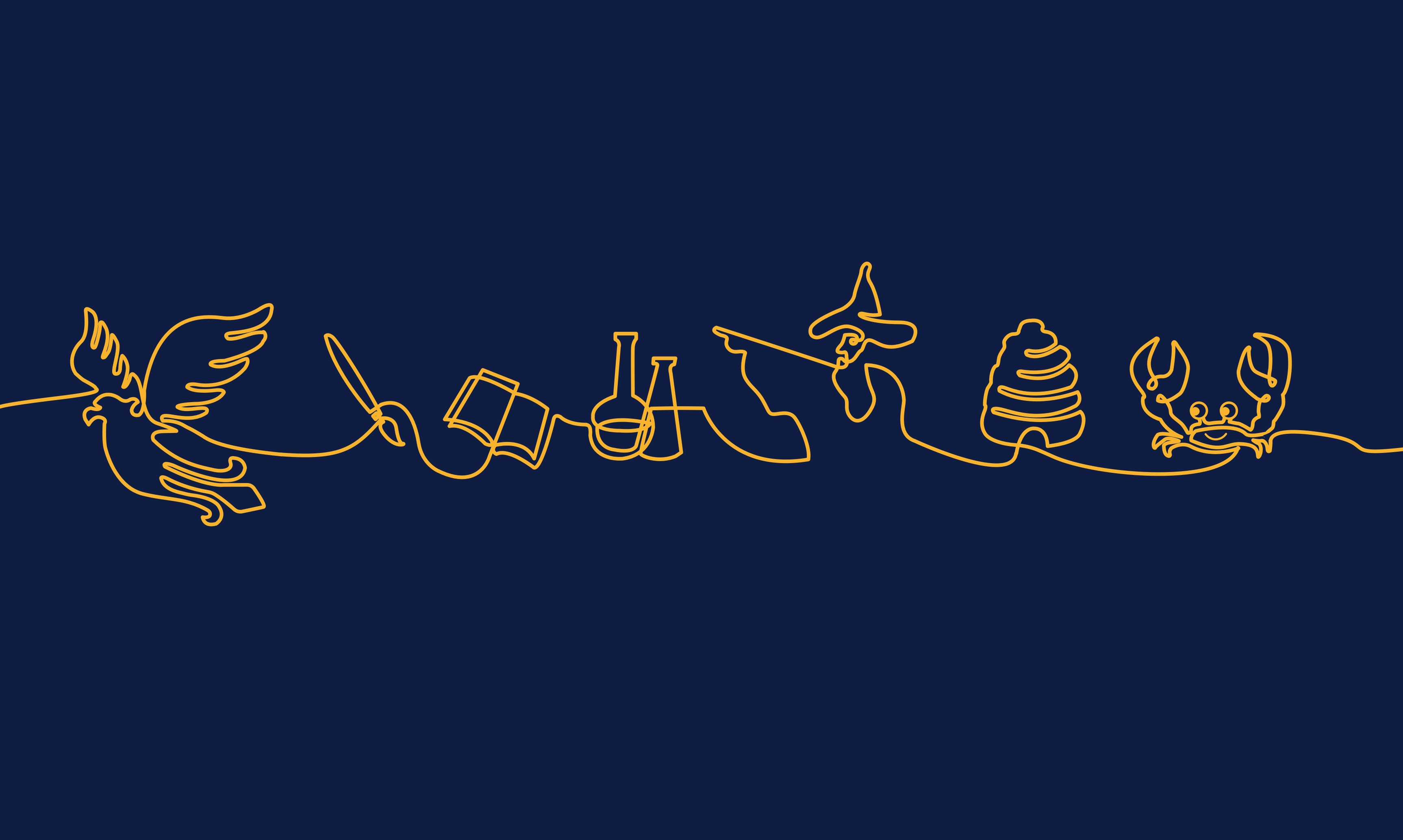
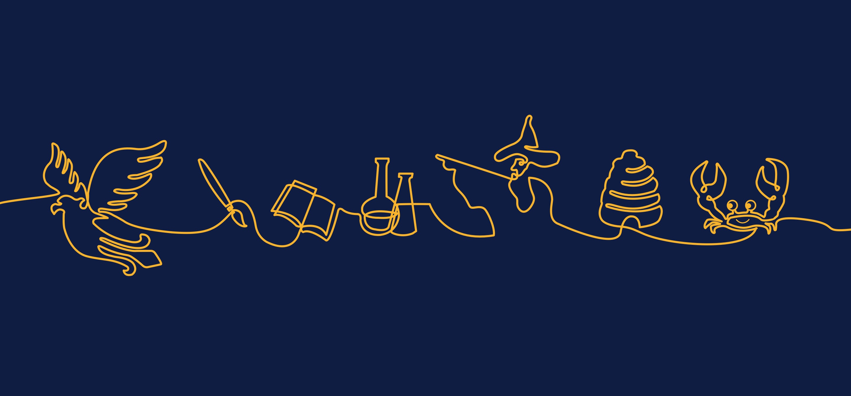
It goes without saying that illustrations add personality to a website. They provide companies with a range of assets, ensuring branding material can always be varied and distinct. A unique style, personal to the brand is exactly what Pennthorpe School needed to stand out from the crowd. We produced custom hand drawn continuous line illustrations of objects specific to the school’s culture and heritage. These bespoke illustrations form a set of one of a kind iconography, giving the school a special individuality within the independent school sector. Using a popping yellow colour reflects the school’s happy energy, whilst the fluidity of the lines creates a playful and creative appearance.
To embellish
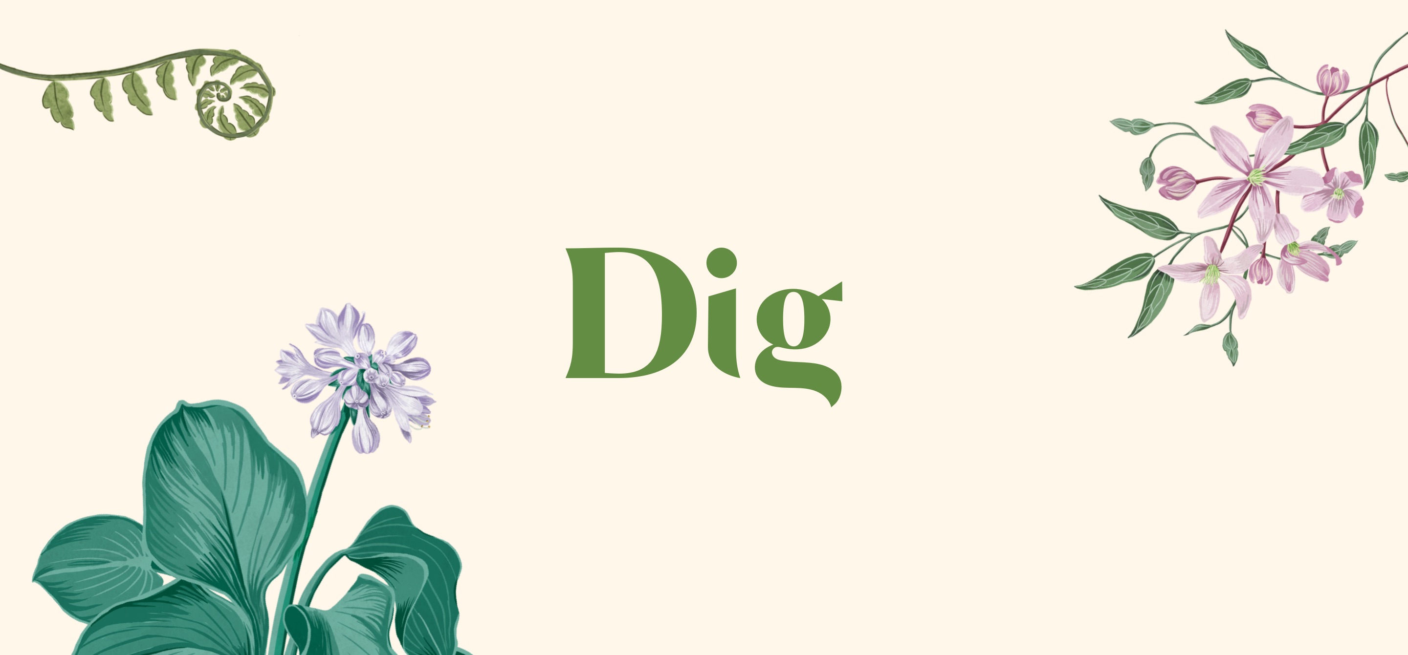
Sometimes illustrations are simply used to embellish an already strong visual identity. Decorative elements are hugely influential in creating a tone of voice. Dig is a start-up helping everyday people create beautiful outdoor spaces. The Web Kitchen created the full brand identity for the company, our chosen bold typography and serene use of photography is paired back through floral illustrations. The traditional hand drawn illustrations are delicate and natural in appearance. These flower illustrations make for an immediately recognisable brand, depicted as high end and elegant.
Conclusion
An image speaks a thousand words. Whether you’re after a tool to inform, narrate, personalise or embellish your brand, illustration might be the solution. These visual devices help set out a company’s mood and tone of voice at a glance. This impact makes them ideal for increasing a brand’s presence online, on printed material or social media. TWK knows the power of illustration, and as a web design agency they’re a key resource, helping create digital brands that are approachable, organic and playful.
Got a project in mind? We’d love to hear about it so please get in touch.


