Top 6 Web Design Trends of 2015
The world is changing and the web is continuously improving to meet the requirements of all users. The greater possibilities offered by technological progress, providing faster networks and modern devices, are increasing the efficiency of the web design world. The number of people connected to the internet for the first time exceeded three billion users in 2015. That’s 40% of the world’s population!
Relying on our experience and undergoing accurate research, we started to investigate the main trends in web design for the year 2015.
1) Discarding non-essential design elements in favour of simplicity
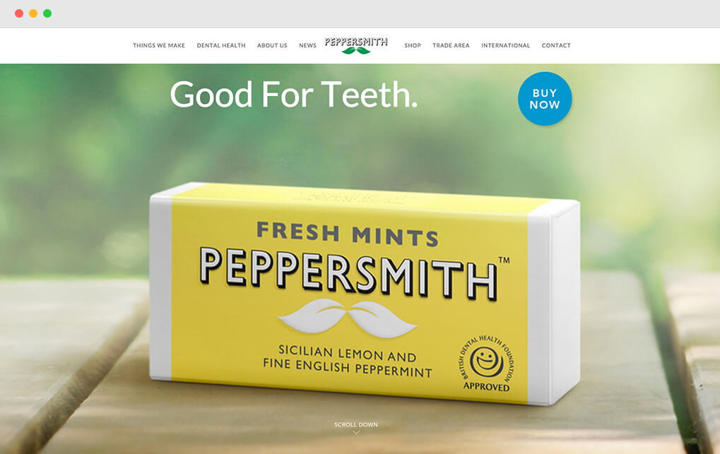
Images, animations, colour backgrounds and embellishments once considered distinctive elements have begun to disappear, aiming at a new point of arrival: simplicity.
If this is true, websites may begin to resemble one another, with graphics playing a secondary role. On the other hand, the result will also lead to increasingly comfortable and user-friendly sites. Users will always feel at ease, knowing how and where to move, and where expert web designers will have the opportunity to stand out from the growing mass of DIY website builders.
2) Material and flat design popularity growing
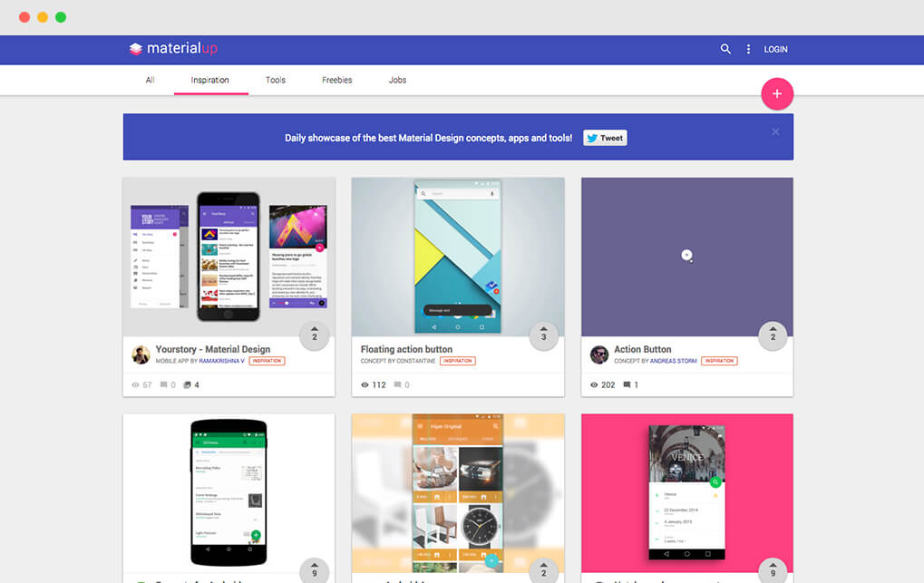
At the end of 2014, Google launched their new style language called Material Design. Thanks to the guidelines provided by Google’s graphic designers it is now possible to easily create graphical and innovative interfaces. Through the reflection of light, the use of shadow effects and the constant movement of objects, images on screen appear more realistic, as if they were formed by real physical objects rather than “cold” pixels.
Material Design was originally produced for Android, but is now one of the most influential trends followed by creatives who love flat design.
3) Long scrolling-page websites
The trend is to create long pages that scroll. Users often prefer to scroll up and down a page rather than switching between them. These are not one-page sites but rather long-page sites.
4) A picture speaks a thousand words
It is essential to dedicate the right time and investment in this important part of our web projects. For years, designers settled for a few low quality photos until stock sites started to provide images to suit every need.
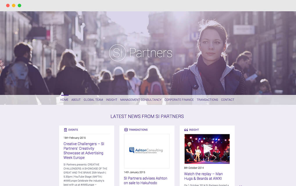
Now that images are at the heart of web design, with their great power of suggestion and communication, they absolutely need to be high quality and focused on the concept. What distinguishes your site from the one of other thousands in the era of the templates? Have unique and beautiful images, photos and videos!
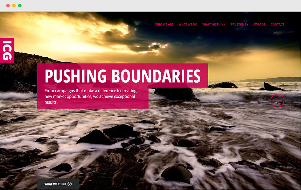
5) Bigger emphasis on large typography
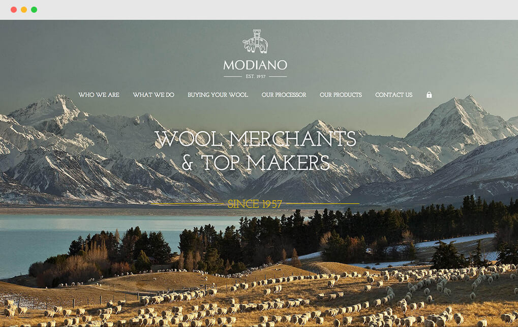
Forget forever the system font! The human eye does not read if not teased by proper layout and attractive short type. There are countless free platforms that allow you to use fonts, without adding too much weight to your site. There are no more excuses, typography must be considered in all respects as a crucial part of web design.
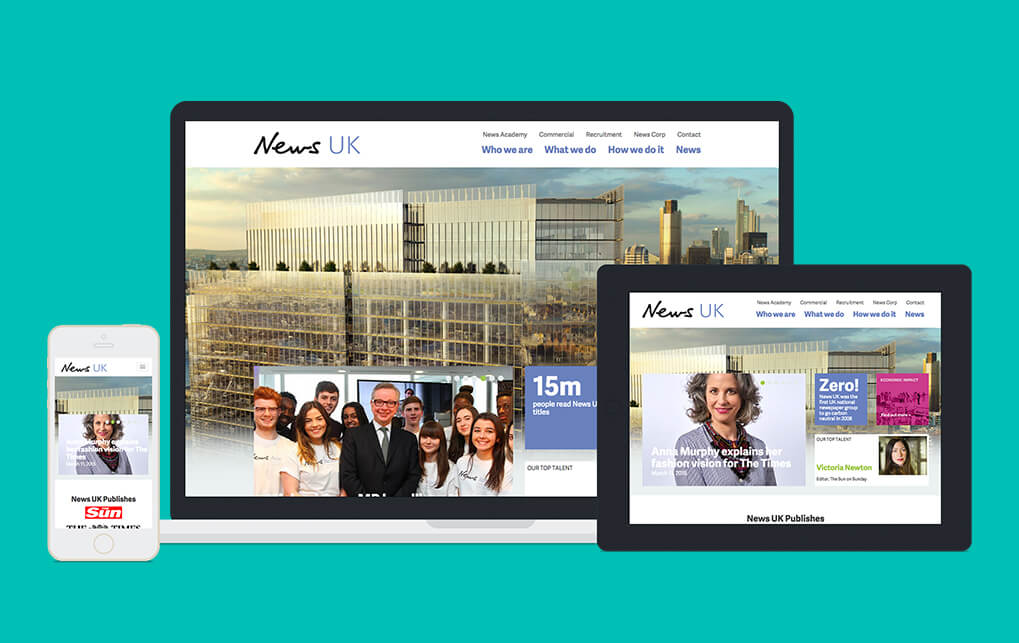
6) Responsive Web Design
Just think about the incredible increase in the spread of mobile devices and the spread of the internet: adapting all the web sites to the different devices has become a must! It’s no longer an option: a website must be suitable for any device, from the desktop to the smartphone.
Let’s hope designers find the above mentioned trends of some help for their projects this year! The must is to stay ahead of the curve: to get in line with the present and (just as importantly) to look back to the past. Keeping up with the times, the ability of recovering the most beloved design trends and make them revive in future works is the special prerequisite of successful designers.
I do hope some of my considerations will prove to be correct as 2015 goes ahead!


