Website inspiration – February 2022
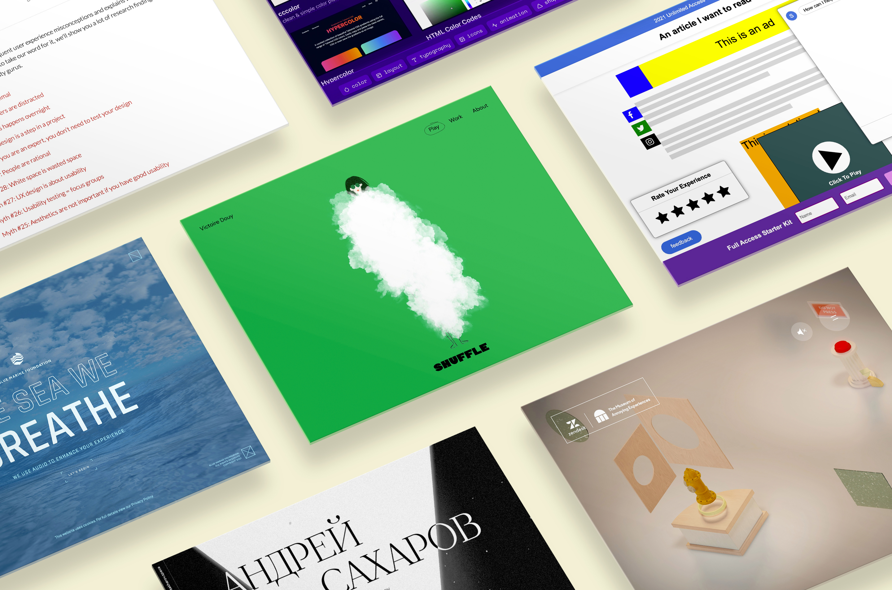
Here at The Web Kitchen, we are constantly on the lookout for interesting articles that give us new insights, as well as cutting-edge websites that provide us with inspiration. In this blog post, I’ll be sharing a few examples of alluring websites and articles that were shared between the team.
Articles
How I experience the web today
A somewhat exaggerated take on all of the extra bloat, popups, notifications and permission boxes that are often present on websites nowadays. Clearly made to be taken as a joke, but I think it’s fair to say that we all recognise a few things from when we browse the web ourselves!
Cccreate
Cccreate is a nicely curated selection of tools and resources for creators on the web, including both designers and developers! I particularly like the Colorable contrast checker and Easings.net for the visual examples for each easing style.
UX myths
This website contains a collection of 39 common myths surrounding User Experience, aiming to debunk each one of them. They do this through articles full of real-world examples and opinions from industry experts.
Inspiration
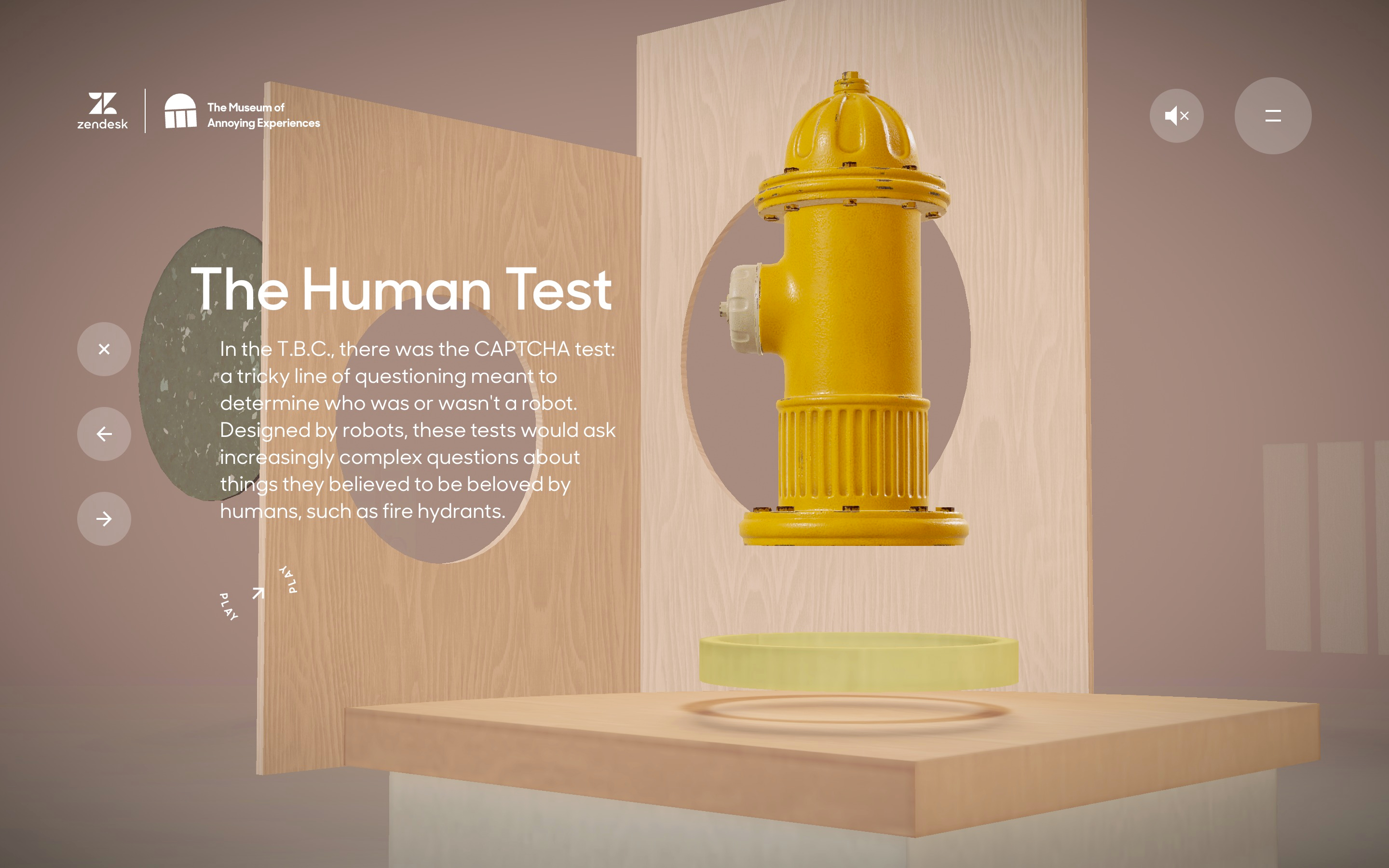
The Museum of Annoying Experiences
Speaking of UX, the Museum of Annoying Experiences is a fun, tongue in cheek display of some of the more annoying experiences online and beyond!
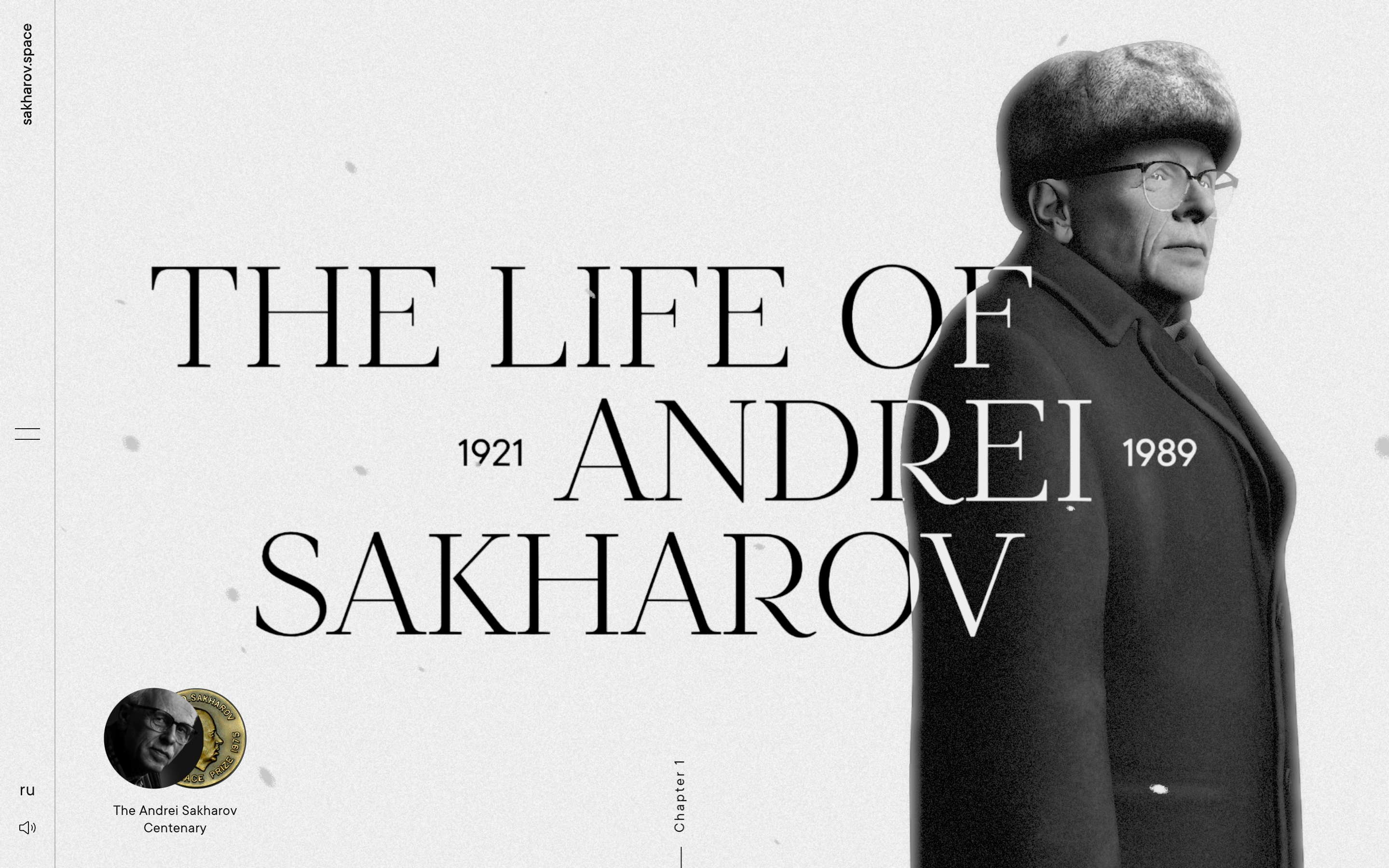
Andrei Dmitrievich Sakharov
A beautiful and interactive website that tells the story of Andrei Dmitrievich Sakharov, who was a Soviet nuclear physicist, dissident, Nobel laureate, and activist for disarmament, peace and human rights. As you scroll through the page, a combination of music, clean typography and 3D graphics keeps you engaged from start to finish!
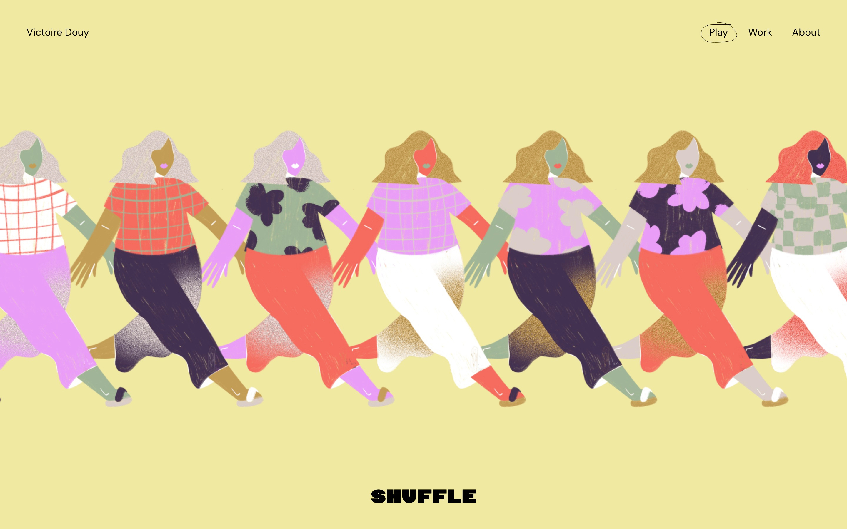
Victoire Douy – Designer / Illustrator
This site shows that you can use playful, fluid animations and still maintain a premium feel. Each time you press ‘shuffle’ in the top banner, you are treated to another beautiful illustration, that can be manipulated with your cursor. I love the line that draws down as you scroll, as well as the fact that you can make it loop around itself by hovering your mouse on it. The font used for the titles is certainly a little unusual, but it does really help with giving this site personality. No matter what style of design you like, there will be something within Victoire’s work that will give you inspiration.
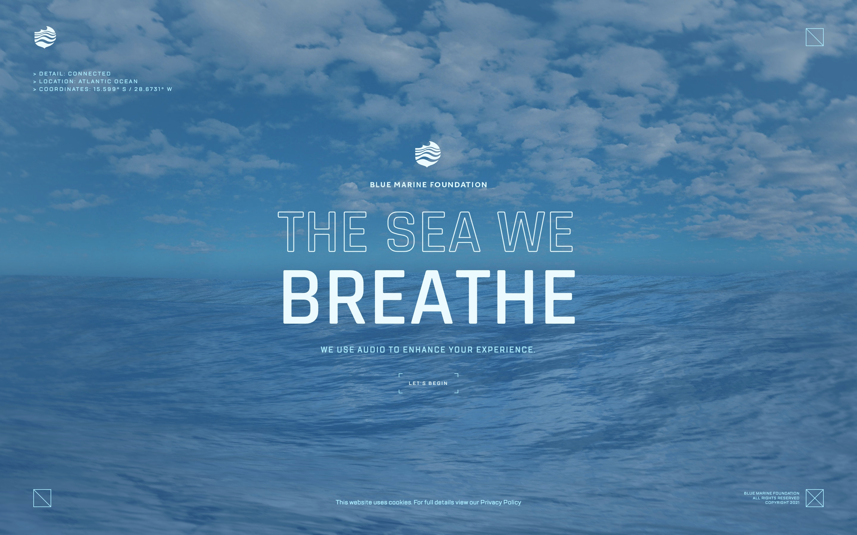
The sea we breathe
A wonderful website with a serious message that highlights just how important taking good care of our oceans is. Using WebGL and narration by none other than Stephen Fry, you are taken on a journey deep into the water and learn about the dangers of overfishing, and how a healthy ocean can help buffer the impacts of climate change.
